[quote=“GameKyuubi, post:9, topic:165”]I can see it. This is my submission.
Updated things a bit. Now with more shine.[/quote]
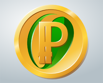
I think that this one looks the best of all of the ones that I have seen so far. The “thin” one could be improved by taking some of the shading concepts of this one IMO. I would rank the three in this order: 1.) this one (9.5/10), the “thin” PPCoin logo (9.0/10), and finally the “fat” PPCoin logo (8.0/10).
[quote=“Sentinelrv, post:60, topic:165”]Gamekyuubi, I took your design and another one that was already submitted and combined them using paint (I’m no Photoshop expert). It’s a very rough version. The only reason I did this was to show you what I wanted to see with your design. I think the brighter gold makes your design look so much better. The only problem is that you’ll have to figure out how to design it this way on your own, as you can’t use other people’s work like I did here. Again, no offense to the designer who originally made the background of the coin I’m using here. This is only to make a visual point to Gamekyuubi and will not be used for anything beyond this post. What do you guys think about this?
[/quote]
I think that his original design looked better, but I also think that you are on to something: the original design is a little bit dark. I think that part of it can be dark, but there should be a gradual gradient from dark to light, almost like if I could combine his original with yours and take the average of them, if that makes sense.
[quote=“Sentinelrv, post:46, topic:165”]Here is the updated version that is less glitzy and bright. Click on it to make it larger. I personally still like the brighter version better, maybe without the sparkles though, but if this version pleases more people then I’m ok with that. How do you guys like this compared with the other one?
I don’t mean to get off topic, but this is really exciting. I feel like PPCoin is about to skyrocket. I have a webdesign business, and I decided to fire Godaddy today. I don’t think that there are any PPCoin based web hosting companies (yet), but I found a company that does accept Bitcoin. I just signed up a new client, and I will be building his site using http://bitcoinwebhosting.net/
They use BitPay, so I was pay for a whole year of premium shared hosting for about 2.69 BTC. I feel like I am cutting the chord with the fiat currency world and diving deeper into the cryptocurrency world. This PPCoin logo contest is exciting because we are getting to see the future being built before our very eyes.
[quote=“GameKyuubi, post:47, topic:165”]Here’s a bit brighter design without the shaded center.
In case you wanted to compare the shine to how a real coin shines, here you go:
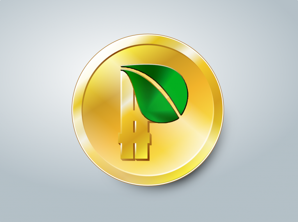
Sent, I think of all the designs proposed, the one you chose was the most “plastic” imo. No offense. The bevels and everything that he added recently are cool and all but the colors still seem unrealistic and more apt to be a piece of colored plastic. Also I’m still hating that green leaf design. Actually, that’s my main reason for entering this contest. So that that damn green grass blade doesn’t make it onto the final product because I think it’s awful. I have tons of PPC and I don’t want that repping my money.[/quote]
Please don’t be discouraged by my earlier comments. You obviously have a lot of talent, and your designs are VERY good. Its just that to me, those last two that I saw had a little bit more of a polished professional look. Some people don’t like that look, so I think that we had a lot of great submissions here, no matter which way it goes. How is this going to work: do we all take a final vote on it?
Once the submissions are over with, I have to setup a poll on the website where people can vote for their favorite design. Then I have to pick the winner based on that poll.
I think this looks much better. I just wish I could see a version of this using the exact same style in the image I posted. The style you’re using here is different somehow. I’m not a designer, so I can’t really explain it. Here they are side by side and you can see the difference…
Edit: Maybe the difference is that your design looks more like it’s 3D where the other one isn’t? I’m not sure.
Sunny doesn’t seem to love it though. Not sure why. He posted about it a little further back.[/quote]
Awhile ago I was researching starting a business making physical Litecoins, similar to the Casascius physical Bitcoins. There are companies that people can go to to make challenge coins. (Here is an example: http://en.wikipedia.org/wiki/Challenge_coin)
I called a challenge coin manufacturer (I don’t remember which one) but they said that they can make ANY design, even strangely shaped coins. IMO, design 48 would make a fantastic physical PPCoin design. You would just have to add a year and value. My idea was to put a microSD card inside each coin with a digital cryptocurrency wallet on it, and then put a tamper seal on it. I found a company online that will use a machine to cut a tiny hidden compartment in a coin, a compartment big enough to put a microSD card inside. You need a special tool to open the coin and pull out the microSD. Using that tool would destroy the tamper seal. Here is one example of a company that compartmentalizes coins: http://www.youtube.com/watch?v=c7C-ScHMKc8
One interesting idea is this: if we as a community decided to support making physical PPCoins, perhaps the design could change every year, and the designs would come from the community.
[quote=“Sentinelrv, post:76, topic:165”]I think this looks much better. I just wish I could see a version of this using the exact same style in the image I posted. The style you’re using here is different somehow. I’m not a designer, so I can’t really explain it. Here they are side by side and you can see the difference…
Edit: Maybe the difference is that your design looks more like it’s 3D where the other one isn’t? I’m not sure.


 [/quote]