Yes, I can setup a poll once all the submissions are in and everyone should be able to vote then. In the mean time I’ve said that you can leave comments on the contest page and give suggestions.
This is the way Sunny wanted it. Gold + Eco. Either all gold or mostly gold with other colors mixed in. No silver or bronze. I can’t really do anything about it.
The only reason I started rating things is because nobody was giving any feedback on the contest page. If you want to see something, or something altered in some way, please post and let them know what you want to see.
I think the logo should be a bit simpler vs. what is being proposed. Too much shading & too much sparkling. But 26-29 is just a bit too rough and akward. No more than 3 colors.
Some people don’t care for the very bright yellow, so I PM’ed the same designer and asked if he could keep the same design, except tone it down a little bit and have the color look more like this. Maybe this is a more acceptable gold color for everyone. Some of the ones proposed so far are just too dark in my opinion
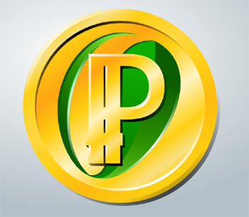
Here is the updated version that is less glitzy and bright. Click on it to make it larger. I personally still like the brighter version better, maybe without the sparkles though, but if this version pleases more people then I’m ok with that. How do you guys like this compared with the other one?
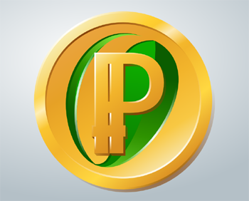
Here’s a bit brighter design without the shaded center.
In case you wanted to compare the shine to how a real coin shines, here you go:
Sent, I think of all the designs proposed, the one you chose was the most “plastic” imo. No offense. The bevels and everything that he added recently are cool and all but the colors still seem unrealistic and more apt to be a piece of colored plastic. Also I’m still hating that green leaf design. Actually, that’s my main reason for entering this contest. So that that damn green grass blade doesn’t make it onto the final product because I think it’s awful. I have tons of PPC and I don’t want that repping my money.
I actually like the one below more because it looks less plain. Also, I think you might be right about the plastic look. I don’t know if that designer can make it anymore metallic looking though. I’d have to ask.
GameKyuubi, I brought up your concern about the plastic looking designs by making a new post so all the designers can see it…
“Some people are concerned that certain designs are a little too plastic looking and not metallic enough. I’m not sure what can be done to address this issue. I would try doing a Google image search for Bitcoin. There are plenty of examples there, some plastic looking and some more metallic and real looking. Maybe that will help to give you inspiration.”
Well Excelsior, you remember you told me to ask for a small time extension. I did that yesterday and they finally just got back to me, almost forgot about it. It seems they reset our timer and we now have four days again. I feel we’ve been coming along pretty nicely, but this will help give us a couple extra days just in case we need it.
[quote=“Excelsior”]You don’t think it looks to yellow though?
I like it. That’s my only complaint. But if others like it that color, no worries here.
The extra time should help us. That’s good news.[/quote]
I did post a different version a couple posts back that isn’t as bright yellow, but I think it might be too dulled out. Maybe somewhere in between would be better?
Oh wow, that’s so much better looking. This is one is perfect for me. It looks much more metallic now and like an actual coin. I don’t know if it can get any better, but we still have time left, so we’ll see.
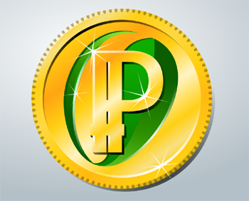
[quote=“GameKyuubi, post:36, topic:165”]Here ya go:
[/quote]
This is my favourite one so far. The other coins are good too, but the green leaf in the P to me screams “iconic logo”. This is something that would be immediately recognizable no matter where you saw it. And that’s important.
I just left comment there. #21 and #49 are my favorite. #21 just needs lighten up the logo background (too dark), the spacing between logo parts looks perfect too me.
series #44 I don’t like. The leaf is too strange and not integrated with logo, so less clean.
Hey Sunny, a question. Let’s say when we finally vote on these and the one with the most votes is a design that you don’t care for. What would happen then?
Also, #21 is my second favorite, but it does need some work as Sunny said. Is there anyway to make the gold color match some of the newer designs that have been posted recently by the designer Lightning?
I need to understand the terms here, do we get the rights to the winner logo or do we get rights to all the finalists? Is the winner decided by our votes?
What happens is I’ll have to setup a poll on the website where people can vote for their favorite design. The voting isn’t what chooses the winner though. I still have the final decision since I setup the contest. I can use the poll to judge which design has the most support and then I can select that as the winner, or some other design for whatever reason. So it’s me that has to select the winner in the end, not the voting. The voting is just a judge of support. We get the rights to the final design that is picked, not all the finalists.
Gamekyuubi, I took your design and another one that was already submitted and combined them using paint (I’m no Photoshop expert). It’s a very rough version. The only reason I did this was to show you what I wanted to see with your design. I think the brighter gold makes your design look so much better. The only problem is that you’ll have to figure out how to design it this way on your own, as you can’t use other people’s work like I did here. Again, no offense to the designer who originally made the background of the coin I’m using here. This is only to make a visual point to Gamekyuubi and will not be used for anything beyond this post. What do you guys think about this?