[MF] Videos and Content for peercoin.net

Back now and active. I’ll be watching this topic from now on. My main concern is that we are creating all this content without a clear goal. Most users either do something or leave within 10-20 seconds.

To maximize conversions I believe the website should operating like this:

  1. Get the user to watch the video
  2. Get the user to download the client
  3. Then tell the user about mining and earning

[quote=“super3, post:41, topic:2686”]Back now and active. I’ll be watching this topic from now on. My main concern is that we are creating all this content without a clear goal. Most users either do something or leave within 10-20 seconds.

To maximize conversions I believe the website should operating like this:

  1. Get the user to watch the video
  2. Get the user to download the client
  3. Then tell the user about mining and earning[/quote]

1. Did you read our plan yet? What did you think?

2. We also need to know if you would fund Chronos and his content creation from the peercoin.net fund (See the OP).

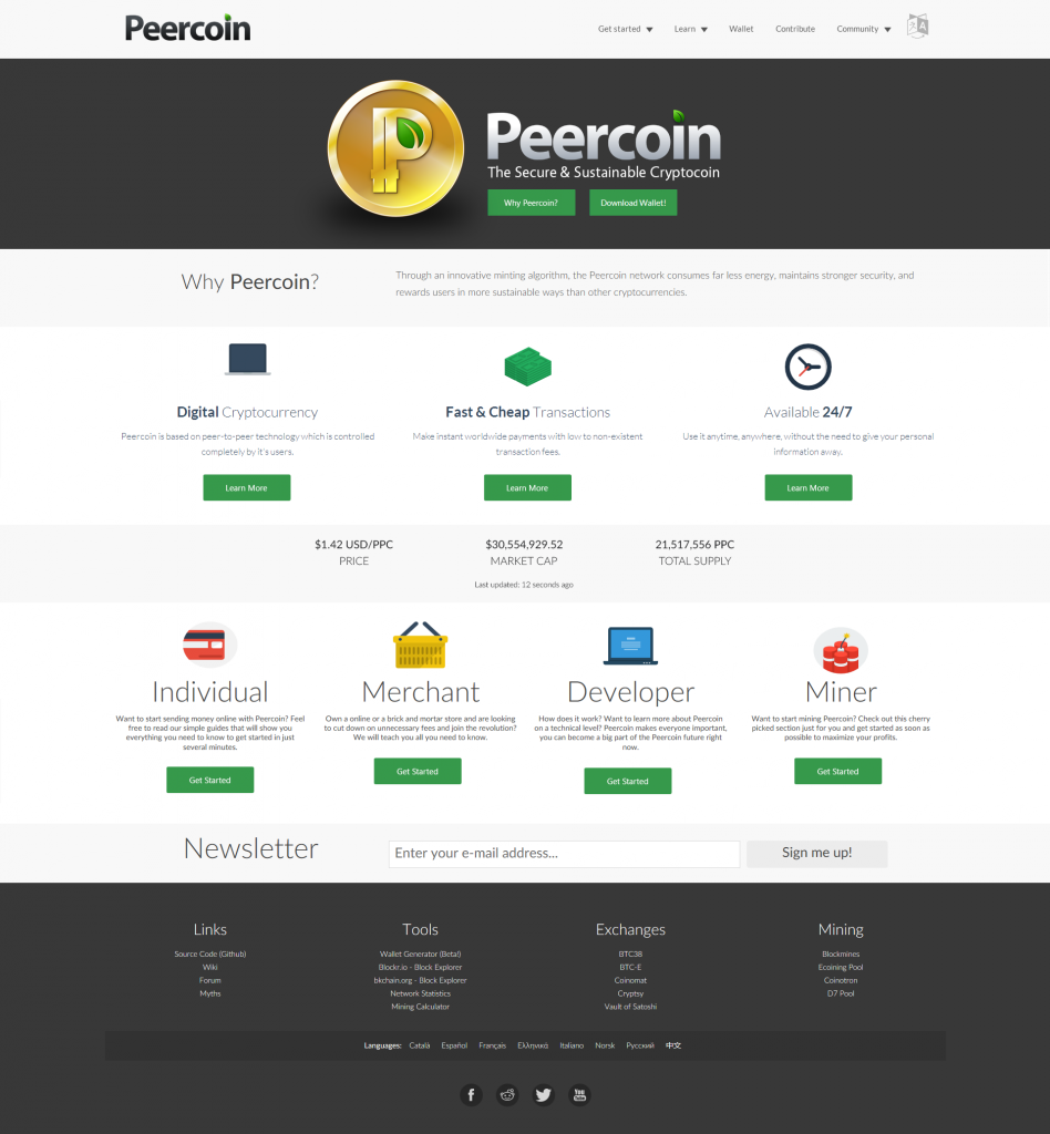
The animated video is missing in the concept image, but it will be there in the final version. And like I said in there, the top half of the website is designed to send people to the sales page to build interest/excitement and get them to download the client. And the bottom half is designed to meet the needs of specific types of people who are looking for information. The top half is the most important part.

Here was my whole post again…

[quote=“TheWildHorse, post:30, topic:2686”][quote=“Sentinelrv, post:29, topic:2686”][quote=“Sentinelrv, post:27, topic:2686”][quote=“super3, post:26, topic:2686”]I propose we do a full stop on development for Peercoin.net and any content. We seem to be creating all these “things” but with no clear goals or objectives.

Notice how things were developed for http://storj.io. The clear goals are to go to the crowdsale or sign up for the invite. On the Peercoin.net site we have way too many buttons and places. TheWhildHorses design simplified that a bit, but its far from fixed.

I think the only clear goal is to get people to download the wallet, and receive/send any amount of Peercoin. After that there should be a clear resource pages, then a guide for mining/minting. The stats speak for themselves:[/quote]

I agree these are important, but what I’m concerned about is whether we’re able to use the website to communicate why they should be downloading our wallet in the first place. Maybe some of the extras can be cut, but we need to make sure there is well designed content in place that explains what Peercoin is, what makes it better/different and why they should care.[/quote]

Super, you’re kind of dropping a bomb on us here, so before we continue down this path, I first want to make sure you are up to date on our progress and understand what we’re trying to do. I know you’ve been busy with Storj, so you probably haven’t had a chance to keep up. First, please look over this document if you haven’t already, as it details the structure of the website that we already have planned…

https://dl.dropboxusercontent.com/u/16393012/Peercoin-content.pdf

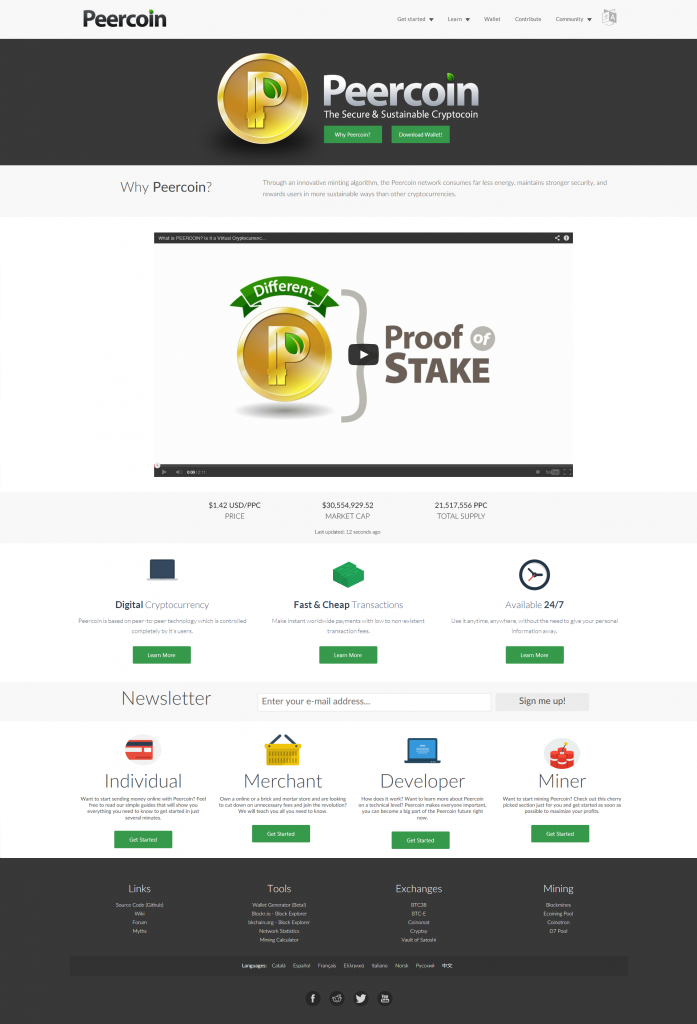
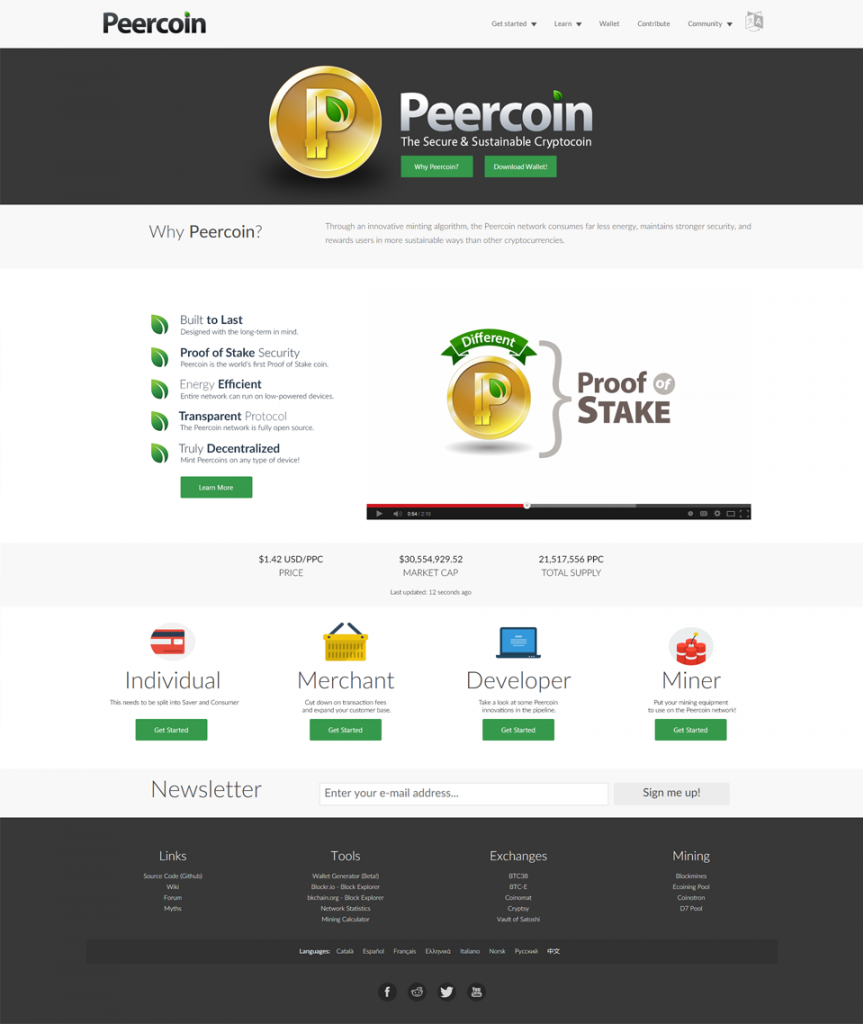
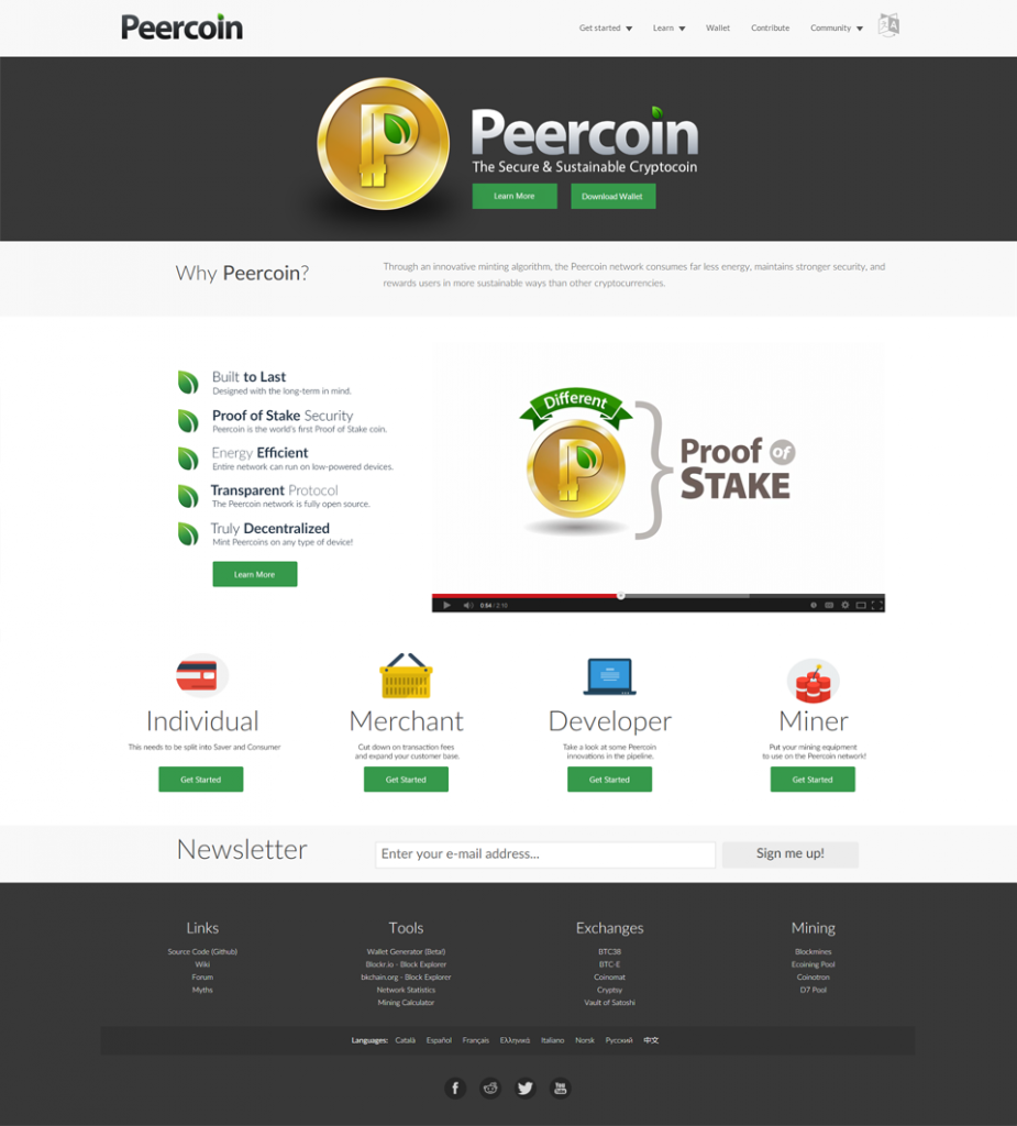
Now please look at this concept image, which is the latest version of the home page design…

http://i2.photobucket.com/albums/y17/Sentinelrv/Other-Images/PeercoinnetRedesign4.png~original

The first thing to note is that the 3 features listed need to be changed to Peercoin related features, as well as all of the icons. Right now they’re all temporary placeholders. Now if you’ve already looked over the document above, you’ll see on the concept image that there is a “Why Peercoin?” button in the logo banner and the 3 “Learn More” buttons under each main feature. All 4 of these buttons will link the user to the same page, which is a general info page explaining what Peercoin is, what makes it better/different and why they should care. It will include short text blurbs for different subjects, imagery that explains concepts visually and a video that Chronos will make that will go over the entire page, maybe even the new animated video as well. The purpose of this page is to get the user excited about Peercoin. Then at the end/bottom of the page we stick the link to the download wallet page.

Your stated goal for the entire website is to get people to download and use the wallet. So when they load up the website they immediately see 2 green buttons under the logos. One button is for downloading the wallet. If they came to the website just to download, there is the link for that. The second button will take them as I said to this general information page. It’s basically a sales page with the purpose of building interest and excitement in Peercoin. This page eventually leads them to the wallet download link.

Now if for some reason the user got to the home page and didn’t click either of those 2 buttons, if they scroll down the page just a little bit, they’ll be greeted by 3 feature teasers. If they finally click one of the buttons here to learn more, they will again be taken to the same sales page, which will build excitement and lead them to the wallet download page. So as you should see, everything on the home page so far is laid out to take the user to a sales page, which is designed to build interest so that they hit that download link. So far I think the intended layout accomplishes your goal of getting people to download the wallet.

Now, this next portion of the website is where I think it moves away from your intended goal. If you go back to the home page and look below the 3 feature teasers, you’ll see 4 user types. If you look at the document linked above, you’ll see this will be expanded to 5 user types, Saver, Consumer, Merchant, Developer and Miner. Each of these user type pages will contain helpful (but limited) information that applies specifically to that type of person. For example, Saver will most likely explain how Peercoin is a great store of wealth, how to keep your coins safe and it will contain links to the minting guide, so they can get started with that. The Consumer page will explain how to send and receive coins and pay for things. The Merchant page will explain how to accept Peercoin as payment. The Developer page will serve as a portal to get people started on the Peercoin projects currently listed on Peer4commit. And finally, the Miner page will most likely link to the mining explanation page and guide.

So the top half of the home page is dedicated to leading the viewer to a page that sells them on Peercoin and gets them to download the wallet. The lower half of the home page is designed to meet the needs of specific types of people that are visiting the website for information. I personally think this is a great setup, however I’m not a web designer, so maybe you know something I don’t. If you wanted to simplify the website even further than this and you needed to remove something, I would say the user type pages could be removed, but everything else is vital. What do you think about all this? Does it make sense to you or no? Please let us know, because we need to make some decisions here soon.[/quote]

Sentinel summed up my plan pretty well. Bitcoin.org does something similar.

Basically, the goal is to have a quick start guide for every type of user, without bugging him about unnecessary details, and letting him jump right in. And if they want to learn more, there will be detailed content on each topic.[/quote]

This was a response to Super in another thread. Just wanted to make sure he saw it…

Are you talking about a link to the video within the dark colored banner containing the icon and text logos and the green “Why Peercoin” and “Download Wallet” buttons?

I don’t think there’s much space for that there. Why not just place the full video underneath this banner? I think there would be a better chance of people clicking play that way.

Here is an example…

http://i2.photobucket.com/albums/y17/Sentinelrv/Other-Images/PeercoinnetRedesign5.png~original

[/quote]

My knee jerk reaction says its too cluttered. Why don’t we go in this direction:

I think the main problem with the current plan is that they are passive content. We instead need active engagements with the user. Let me sketch my ideas.

[quote=“super3, post:44, topic:2686”]My knee jerk reaction says its too cluttered. Why don’t we go in this direction:

[/quote]

I agree with you that it’s too cluttered looking, though I don’t think we should start from scratch. I think it might just need some alterations, so I made another concept image below using some influence from the example you just posted. Here are some things to note about it…

The concept image below still needs some visual changes, therefore it’s not final:
1. The video is now smaller and positioned to the right side of the screen.
2. The 3 Peercoin features have been expanded to 5 features and they’re now positioned vertically and to the left side of the video.
3. The 5 features each have a little green leaf icon next to them. Either these can remain, or TheWildHorse could make different green icons to fit with each idea.
4. The “Learn More” button underneath the 5 features goes to the Peercoin general info/sales page that was discussed previously.
5. The 4 user types at the bottom need to have their graphical icons changed, preferably green icons and less color to help make it look less cluttered looking.
6. “Individual” still needs to be split into “Saver” and “Consumer”

Super, do you think this makes for a more organized home page?

Full Size: http://i2.photobucket.com/albums/y17/Sentinelrv/Other-Images/PeercoinnetRedesign6.png~original

Right now the current plan would include written text, visual imagery and video guides for different content and user type pages. I’d be interested to hear what you mean by active engagement.

Also, sorry to take over the thread Chronos made. This all needs to be figured out before we can get an approval on spending any funds.

Sentinel
On my screen the image is huge - is it possible to reduce the size by 50%?
Thanks

[quote=“RobertLloyd, post:48, topic:2686”]Sentinel
On my screen the image is huge - is it possible to reduce the size by 50%?
Thanks[/quote]

If I do that then you might not be able to read the small text. Can you click the full size link instead? It should automatically zoom out so you can see the whole thing. Here…

Full Size: http://i2.photobucket.com/albums/y17/Sentinelrv/Other-Images/PeercoinnetRedesign6.png~original

Here is the half size version in case you need it. Remember to check my post above for more details. A lot of these user type graphical icons are not final and will need to be changed. There’s too much color in them. I’d rather them be green or gray looking, rather than multicolored. It would look even less cluttered if this happened. The green leaves could also be replaced with various small icons.

http://i2.photobucket.com/albums/y17/Sentinelrv/Other-Images/PeercoinnetRedesign6HalfSize.png~original

That’s a lot better, thanks

Do you think it looks more organized with the features listed vertically and side by side with the video? With the icons changed I think it could look a whole lot better.

Honestly I think it looks pretty good. I think it’s pretty important we get something up - all the outdated info needs to be replaced ASAP.

We can’t do that without Super’s approval though. That’s why I’m trying to make it better so he’ll approve it. Then we can get the funds for TheWildHorse and Chronos to finish this. We can’t keep waiting while inaccurate info currently exists on the website, plus the fact that it makes it hard to advertise without a finished website.

I agree, this mock-up does look very nice. I think we are on the right track. Hope super3 can approve this as we really need to move this. But I’m saying the obvious I guess.

I think we need input from Chronos, as I get the feeling he has a vision for the content of the site, and this affects the homepage

On a purely aesthetic note, I like the leaf icons, and agree with TheWildHorse (another thread) that individual icons are not needed. I also like the vertical arrangement of bullet points. It is neat and compact

For the page as a whole, I think there are too many “rows” (perhaps this causes the “clutter” Super3 refers to?). I wonder, therefore, whether we can consolidate some of them:

a) do we need the price, market cap and total supply data as a “feature” in the centre of the homepage? I feel this data should be in smallish text, in a top corner - always available, but not taking up too much space

b) Can the email newsletter become another green button, at the top in the black area?

c) Do we need the green button saying “Why Peercoin?” when we are asking this question again just underneath?

I’m going to try removing this in the next concept image I make. I can maybe put it back in on the upper navigation bar at some point, but for now I’ll remove it to see what it looks like.

We’ve already tried adding 3 green buttons here and it was too cluttered looking.

That Why Peercoin button and the “Learn More” button lead the user to the main Peercoin information/sales page. Check this post to read my description of it: http://www.peercointalk.org/index.php?topic=3160.msg29979#msg29979 Maybe I can change the wording so both buttons say “Learn More.”

Here you go. What do you think of that?

In my opinion, this is looking better and better. Good work, Sentinelrv and Super3.

Unfortunately, I am not a UX designer. Although I am a decent writer (as are you, RobertLloyd), visually arranging content and art is not my strong point. I would prefer to leave that job to those who have greater expertise, and then fill in, after the fact, with the appropriate written and video content.

I have been keeping up on this conversation, and I like the direction it’s going.

Not sure about removing the bar with price etc. It provided some visual balance. I believe it looks more cluttered now, but that is possibly because of the multi coloured icons underneath. Maybe they don’t need an icon, just a button style with the text in the same bar/banner the price was in. Or maybe just leave the price where it was and remove the ‘cluttered’ icons.

Just my thoughts.