I tried to do this for you. I couldn’t remove the green box though, so mentally delete it. I personally think it makes everything look too plain. before, the buttons were a different shade of dark gray than the background, plus the silver home button and the green while hovering over a button. Now you have some more room for more buttons, but you’re also missing some of the color that was there before.
[/quote]
I’m not really a fan of the dark theme in general, but getting rid of the tab structure for something like this would be fantastic.
Remember, like I said, if you remove the tabs like my example above, the only green remaining in the design will be the balance text and the divider, not nearly enough in my opinion. All you’ll be left with is dark gray and silver. I think the green button and tip text is important to help break it up.
Remember, like I said, if you remove the tabs like my example above, the only green remaining in the design will be the balance text and the divider, not nearly enough in my opinion. All you’ll be left with is dark gray and silver. I think the green button and tip text is important to help break it up.[/quote]
Took me a while to come up with this, but if we use this theme we can advertise that Peerunity has the “Greenest” client. It’s a very hot buzzword these days.
Okay i’m probably not helping here. I’m going to go back to testing stuff. I still think tabless client is sexy.
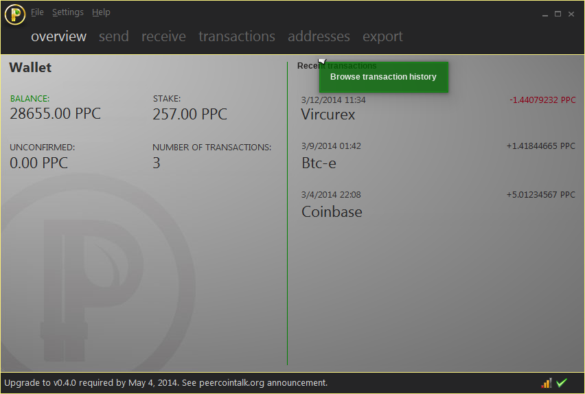
Thats the best version i think, i would only change the golden logo in the top left corner to Peerunity letters so there aren’t two logos on the same side. The peer unity letters could be in the lower left corner or where the logo is now.
i look at Sentinelrv design, to be honest i had no idea how to implement those logo+qmenubar+min/max/close button. afaik stylesheet cant do that.
i take quick look at megacoin and worldcoin, they using qpushbutton as replacement for qmenubar. obviously dont count on my poor qt skill, im not programmers.
so far i got this.
PLEASE IGNORE WINDOWS BORDERS, its Linux KDE windows border
my old design, and yes the logo just place holder for light version.
Well, we’re not exactly done trying to figure this out yet. I’m waiting on a png file from Ben so I can make a couple more versions. We’re probably going to have to end up putting several finalists up for vote.
Sva, do you feel we should find somebody else that has better skills with qt to implement the final design? If so, we may need to give you only part of the reward money, since it’s not finished. We’d have to see what others here think about that.
[quote=“Ben, post:31, topic:2500”]I haven’t had much time to dedicate to provide feedback on this, but I needed a mental break from some other work, so I used that opportunity to try out a couple of ideas:
[/quote]
Can someone tell me where I can find this stylesheet? I would like to take a crack at it.
I do like the Peercoin watermark in the background; it is much more subtle than other versions that I have seen.
Some criticisms:
[ul][li]I feel that the font sizes are a bit too variable. We need to make them a bit more consistent and definitely smaller for the recent transaction names and the wallet values.[/li]
[li]Is it also possible to round the window’s corners?[/li]
[li]The logo in the corner may need to be taken out, the logo in the background is enough.[/li][/ul]
I like the green “leaf” buttons and the big logo watermark.
But I really think the background should be lighter, almost white in my point of view.
It feels really too dark to me and even a bit hard to read for the right part of the screen.
We should take accessibility into account here.
Thanx for everybody involved, you’re doing a great job.
I’ve been searching for a place to stick the Peercoin text logo. Now that the icon logo is watermarked into the background of the client, the one I added to the top left corner is redundant. I was thinking about replacing it with the Peercoin text logo to see how that looks instead. I’m just waiting on Ben for that png image. He’s delayed at the moment though.
[quote=“mably, post:52, topic:2500”]But I really think the background should be lighter, almost white in my point of view.
It feels really too dark to me and even a bit hard to read for the right part of the screen.[/quote]
I’ve heard this criticism several times, but I lack the design skills to fix it. Does anybody know how to create a lighter version of the gradient background? It would need to be 850x462 pixels in size in order to fix the background in our concept images here.
But I really think the background should be lighter, almost white in my point of view.
It feels really too dark to me and even a bit hard to read for the right part of the screen.
We should take accessibility into account here.
My thoughts on this are that it is worth creating both a default “light” theme and an optional “dark” theme. While I personally gravitate toward dark themes when given a choice, I really don’t like applications that force it upon me. Most major operating systems rely upon standard white/light backgrounds for native GUIs and when applications veer from this they can appear a bit unrefined, adventurous, or even subversive.
I think about my banking/financial websites and they all adhere to white/light themes. I believe I would even be a little suspicious of a “dark” banking website theme. It conveys secrecy and risk. Peercoin is aiming to be a secure, long-term store of value - people may one day be counting their life savings in PPC - and I think the primary interface (the wallet) needs to appear trustworthy, if even bit conventional, in order to encourage wide adoption.
Development resources to implement those themes. It’s a great idea, but right now we don’t have enough people who are willing or able to step up to help make it happen.
 [/quote]


 [/quote]