[ul][li]Why Peercoin should --> Investors, not Newcomers[/li]
[li]Learn More should --> Investors, not Homepage[/li]
[li]Miners Get Started should --> Mining, not Miner[/li]
[li]All user pages URLs should be plural (the URL bar shows Newcomer instead of Newcomers, for example)[/li][/ul]
What do people think about adding icons for the 5 user types? I’m not sure if it would be beneficial or not. I think the page looks pretty good, even without them.
I feel we have some overlapping or mixing of button titles on the homepage:
I would argue that the “Learn More” button under the leaf points is no longer necessary, because the route to learning more about the leaf points is the video to their right - and once the 2-minute video concludes, the viewer is then invited to view the 38-minute video. Therefore, I think the Learn More button is distracting, and duplicates the “Learn More” option at the top of the page.
Another button title that we might reconsider is the green one in the black area that says “Why Peercoin”; I see two problems with this wording:
i) immediately under the black area, we again say “Why Peercoin”, and answer that very question
ii) further down the page, the link leading to the same page is called “Get started” in relation to “Newcomers”
I suggest an alternative is to change the green button in the black area from “Why Peercoin” to “New to Peercoin” - this avoids duplication with the sentence below, and makes the button broadly consistent with its twin down the page. Any thoughts?
TWH, is it possible to move the Peercoin text logo and slogan just a tad lower? It seems just a little too high to me right now. I think just a nudge lower will fix it…
I believe the words transparent and efficient should be the words that are bolded, since they’re the most important words that should be emphasized. Doing this though would throw off the pattern of bolding the right, then the left, then the right and so on. To fix this, you could just move energy efficient up one and transparent protocol down one. Does anybody agree with this?
I agree with making Transparent and Efficient bold, as it fits the pattern set by the first two bullet points:
Built, Distribution, Protocol and Energy - these are the things that are being described
To last, Fair, Transparent, Efficient - these are doing the describing
The latter group - words that are doing the describing - should be in bold.
But I think the bullet points should be kept in their present order, as they form a sequence. For instance, minting, which is the future, should come last. I doubt whether the bold parts alternate visually would be noticed, either way
To me, it doesn’t matter very much if we swap the bottom two elements. It’s nice to have the bold words alternate, but it’s also nice to have the points form a coherent sequence. Either way is fine with me.
I have copy-pasted the four leaf points into Word, swapped the last two around, and read them afresh - it does not sound as “disjointed” as I thought it would. In fact, concluding on “open source” is perfectly suitable.
So, I am happy with the conclusion that Chronos has already come to: “swap the bottom two items, and adjust the bolding as recommended”.
I recently reported that, on my browser at least, the video on the Homepage had size issues, and would not stay to the right of the leaf points. Whatever you did has fixed that problem.
However, I have noticed that other items are “condensing”, for want of a better term, prematurely. Here are some examples:
(or maybe it is just my browser … but you might want to take a look)
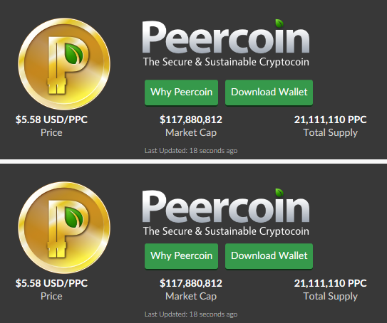
The “$5.58 USD/PPC”, and the “21,111,110 PPC” go onto two lines, even though the screen is very wide
In this image, the User types go into single column, even though the screen is still wide
This is the Merchant page. At this width of screen, the clock image and text are alongside each other horizontally … but in the next link, below, I have reduced the width of the screen by a quarter-inch, and the image and text have reshaped vertically:
My point here is that the page is still wide enough not to have to change the image/text shape, which pushes the page “downwards”.
Other “User” pages react similarly to a narrowing of the screen. Obviously, if the screen is narrowed a lot, the pages must condense, but I think the reshaping is happening too soon
Chronos, on the homepage, you have produced an answer the question: Why Peercoin?
“Peercoin maintains a high level of security, by rewarding all users for strengthening the network”.
I wish to draw your attention to the following recent post by LeChatNoir, specifically the words that I highlight:
“I think it will not be the fairest distributed coin that will win the cryptocurrencies race. It will not be the most accepted, it will not be the oldest one and it will not be the coin with the most futures built in. I’m sure it is the coin which provide the strongest network at the lowest cost to win the cryptocurrency race, that’s why i’m very interested in peercoin”.
LeChatNoir’s phrase (and thinking) has a certain dynamic to it: “the strongest network at the lowest cost”
This is not a description of what Peercoin is (as yours is), but rather what we want Peercoin to be. It is describing a vision, and it explains why we believe Peercoin will be a winner.
I was wondering, therefore, whether you might consider amending your sentence to reflect or incorporate LeChatNoir’s thinking? For example:
“Peercoin seeks to be the coin with strongest network at the lowest cost”
or
“Peercoin seeks to be the coin with strongest network at the lowest cost, by rewarding all users for strengthening the network”
[quote=“Sentinelrv, post:44, topic:2716”]TWH, is it possible to move the Peercoin text logo and slogan just a tad lower? It seems just a little too high to me right now. I think just a nudge lower will fix it…
[/quote]
Does anybody else think this would look better or is it just me?