[quote=“Chronos, post:1, topic:2716”][hr]
To the right of “Why Peercoin?”
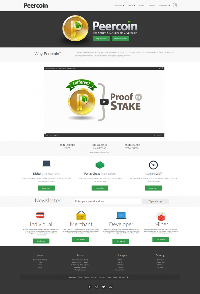
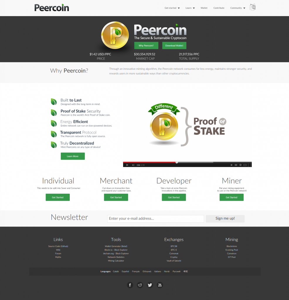
Peercoin remains more secure than other cryptocoins, by rewarding all users for maintaining the network.
[hr]
In place of “Digital Cryptocurrency, Fast & Cheap Transactions, Available 24/7”
Built to Last:
Peercoin is the world’s first Proof-of-Stake coin.
Transparent protocol:
The Peercoin network is fully open source.
Energy Efficient:
Mint Peercoins on any computer!
[hr]
Consumer:
Learn how to buy, sell, spend, and store Peercoin.
Saver:
Peercoin minting yields a guaranteed 1% reward.
Merchant:
It’s time to cut down on transaction fees and expand your customer base.
Developer:
Take a look at some Peercoin innovations in the pipeline.
Miner:
Put your mining equipment to use on the Peercoin network![/quote]
I think that Consumer, Saver, Merchant and Miner would read better in the plural (Consumers, Savers), etc. since we are appealing to whole communities
With regards to “Developer” (or “Developers”), this word jars somewhat with the text that follows. I realise the aim is to refer to five types of people rather than topics, but “Development” fits better, sounds dynamic and perhaps less techie
I would much prefer that the exclamation marks are not used.
Regarding Merchant, I am not sure we can justify “and expand your customer base” because Peercoin’s acceptance is not (yet) wide enough. How about: “Cut down on transaction fees on payments from anywhere in the world”.
Regarding “Why Peercoin?”, I would remove the reference to other cryptocoins because they would react to this, and we don’t want a “cold war” with other cryptos.
Trying to sum up Why Peercoin? in single sentence or two is incredibly difficult. Other coins promote a single aspect: fast transactions, anonymity, tipping, etc. Peercoin is more about the creation of stability itself by, for example, offsetting coin inflation with fee destruction deflation, or by decentralising coin creation through minting, etc. Somehow, we need to get this essence across!
Hope the above comments are useful
 A quick search shows that apparently “pike” is more correct than “pipe”, or I personally think “in the pipeline” sounds better :))