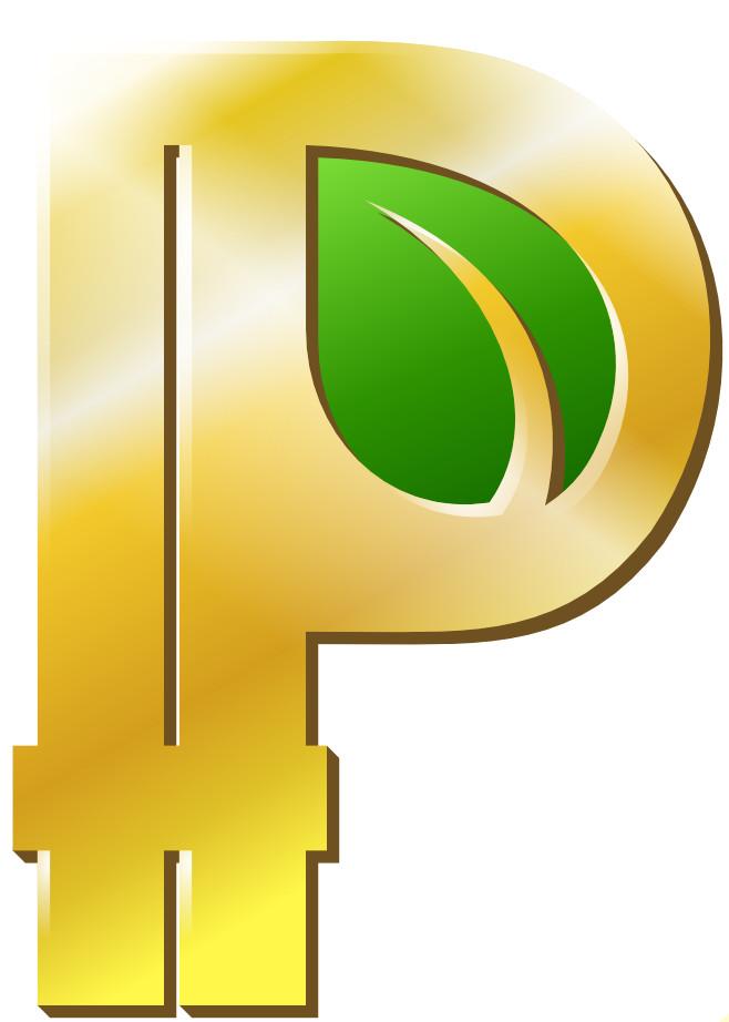
I personally think the minimal versions in #3 and #4 are improvements over the original, but I think it’s still too difficult to tell what I’m looking at. On the other hand, with #2 it’s pretty clear that I’m looking at a small Peercoin leaf. #2 is visually clear and recognizable, where the others are too small and harder to see. We have also used this leaf on all Peercoin related marketing and branding, in all logos: Peercoin, Peerunity, Peershares & Peerbox, also on Reddit, Facebook, Twitter and our website.
In addition to the P, the leaf symbol also represents Peercoin, therefore I’m voting for #2.
The leaf does not look like a coin, and the others dont look mature or stand out.
I think this one would stand out the most, and looks like a backbone currency
It doesn’t need to look like a coin. As you can see from CoinMarketCap, there are plenty of logos on there that don’t look like a coin.
The leaf is a symbol that also represents Peercoin, besides the P symbol.
The image of the logo you posted is for Peerunity, not Peercoin. This is our wallet logo. It’s separate branding and would lead to confusion if it was shown next to Peercoin, instead of Peerunity.
Nevertheless, I added it into the image below as #5 and in my opinion it’s too light and shiny in areas and hard to see…
A quick source edit attempt with crypto_coiner’s suggestion rendered me this, https://imgur.com/lHialWD.png
but would probably look better made smaller properly in a picture editor. I see potential in the idea anyhow. Edit: Sentinelrv’s argument about brand confusion seems sound though.
it is the most catchy and will generate the most klicks.
Although Environmentally-friendliness is only a side aspect of Proof-of-stake.
Since the word “Peer” is part of the coinname, and the coinname is also displayed at coinmarketcap, the symbol used at coinmarketcap doesn’t need the “P”.


