Criticism will be taken personally, thx
2 Likes
Hi, Sentinel
Thanks for the explanation. There’s no pressure, I’m happy for you to go with what your most comfortable. Take the suggestions you like, ignore the others.
So you understand my thinking, although we are calling it University, it is not education in a literal sense (for exams, etc.), I see it rather as telling a story - the story of bitcoin to peercoin. We want the reader to keep pushing forward, turning the page to find out what happens next, and to get to the part on Peercoin.
I have merged a lot of your changes from chapter 2 and 3 so far. Not all of them of course, but a lot of them. You can see them here: https://university.peercoin.net/
What a wonderful website, well done to all involved.
A few observations/suggestions
In the main menu, along the top, there is Learn. But when clicking Getting Started, the first subheading it leads to (further down the homepage) is, again, Learn. I would change this to something else, like “Basics”
The little logo for Mint (hammer and anvil) – how about using the peercoin leaf?
Latest Blog – there are three entries – if there’s always going to be more than one on the home page, change heading to plural (“Latest Blogs”)
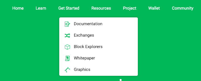
The Drop-down under Project includes “Foundation” – I’d change this to “Peercoin Foundation”
Wallet page
The line “For general inquiries, the Peercoin Foundation is here to answer!” seems out of place, maybe the help link further down (“Additional help can be found in the Peercoin [Documentation] or by asking on our [Forums]”) can be moved to this position.
The Paper Wallet on this page looks a little marginalised - can the paper wallet link (the square with the leaf) be doubled in size to make it more prominent?
Newsletter
Suggesting replacing “our newsletter” with a name, such as Peernews, or Peercoin News.
Remove the exclamation mark.
Community
Community is within Resources – I think it is better if the two have different pages. Community is people, Resources are things.
Graphics – it says “Looking for more graphics?” – I would take out “more”
Brand Identity – I think this short text section is better located above graphics. In fact, there could be a single title: Brand Identity and Graphics, since they go together neatly
If Community is split from Resources, I’d put Brand Identity and Graphics with Community, and White Paper with Resources
Youtube - I notice that Chronos’ videos are gone – can these be got back?
I tested it in safari, here are my remarks wrt UX:
the top-menu is quite confusing; it has no triangle when I hover a word, nor does it have a underline or something While I mouse-hover, while some words do not suppose to have a dropdown: Get started en Wallet
We did not have anyone who could test on Safari during development. Is it possible to share screenshots of the problems you are talking about?
It is also reproducable on chrome browser:
Resources is focussed but Nothing indicates that state:
there should be a triangle and some other visual clues on the word Resources that it is collapsed:
The problem with using basics here is that it links to university, which does show some basics, however it eventually goes on to advanced material. Learn to me sounds like a good word for both elementary material as well as advanced. Currently I think using the same word makes it sound consistent.
We don’t want to overuse the Peercoin symbol. The pick axe has always been associated with PoW mining and the hammer/anvil has always been associated with PoS minting. I’m not sure why we would change that now.
This sounds a little strange to me. That word I assume was referring to the Medium Blog itself, which is singular. We don’t have more than one blog. Maybe add a word there instead? Latest Blog Posts?
I’m fine with this.
To keep the same length on mobile devices so the text doesn’t wrap back around, maybe just “Subscribe to Peercoin News”.
The only reason it looks out of place is because it is inconsistent with other pages in that the header doesn’t have any buttons under the title and description. @Buckkets can we add some buttons there to fix this? Let’s just add Contact Us, Technical Support and Frequently Asked Questions or FAQ if that doesn’t fit in the button.
I understand your argument here, but please consider that people will not click every page on this website. We wanted one page in Resources where we put literally everything extra that people may need to know. This way they won’t miss our community sites because they don’t click on a different page.
Maybe, I’d have to look. Maybe a playlist can be created.
We did have it above originally, but it didn’t look too nice because it was not consistent with the square block sections above it, so I had Buckkets move it to the bottom.
1 Like
Will take a look. Wallet/Get Started do not have sub menus therefore do not have more drop downs. I’ll add hover/active under lines to the menu items
Edit: Fixed in my version. Will be reflected after my push and PR
looks great, roadmap links to 404
Thanks, for pointing that out. @Buckkets the roadmap needs to be removed in the footer until we launch it.
#1 is that line break intended, if yes… why?

#2 non moving and moving header: just pressing on the “Learn” and “Project” button leads to “#” -> home page
#3 is there a chance to get an even amount of elements split evenly among rows? talking about this:

8 elements that would make two perfect 4 item rows 
maybe it’s just my screen width though… (also… the sorting of elements seems quite random to me, might be intended)
No that nav should not be like that. What browser are you using? I don’t see it like that.
Firefox 64.0 on Linux
1366 x 768 px
Other note, and I think I raised this before somewhere:
I can’t find any information on our current checkpoint implementation in either:
the new site
docs
university
If I came across Peercoin for the first time, read through all the “official” material and then discovered checkpoints in some other resource outside the “official” material, I would very quickly think scam/fraud/they’re hiding something/whatever.
We just did not bother as they are to be turned off pretty soon. I can write up some intro article on docs to explain what it is and why it is.
1 Like
One last thing: In terms of design I would personally prefer a on hover button shadow effect over the current underline hover event.
Can you elaborate?
Looked at doing these but never committed to doing the inverted color thing. I can make it happen.
Had issues getting it to load correctly on multiple screens. Right now, standard box reads like this for example. Leaving it as col-3 also lead to it breaking.
<a class="col-xs-12 col-sm-12 col-md-3 col-lg-3 bigbutton-white" href="https://talk.peercoin.net/">