As far as I’m aware sunny won’t be jumping on board a new design until at the very least it has clear support, thats worth noting to allay any fears that a logo will be picked up hastily, as with all these things it’s down to the eye of the beholder what works for one doesn’t work for another. I’m still not clear if it’s to be PPcoin - Peercoin or P2pcoin, or the text font for that matter. There’s still plenty of time for more designs from those that have spent time already and anyone else that gets the creative urge 
I sort of thought that Sunny was just taking a ‘hands off’ approach to this (and I may be wrong), or in other words was allowing people to decide this on their own…I mean since he hasn’t really commented upon any of the designs lately one way or another (even though I asked him too ![]() ).
).
I also sent you a PM on here, bitcoinfridge.
Not putting words in his mouth of course as he wasn’t initially pushing for a logo redesign he may hold judgement to see how well any designs are received before weighing in with an opinion. Maybe more designers could give it a go I’m sure there are a few lurking 
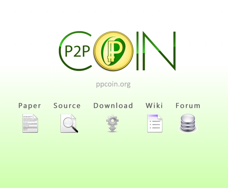
I like the suggestion for a facelift of ppcoin.org that is posted on https://bitcointalk.org/index.php?topic=101820.1200
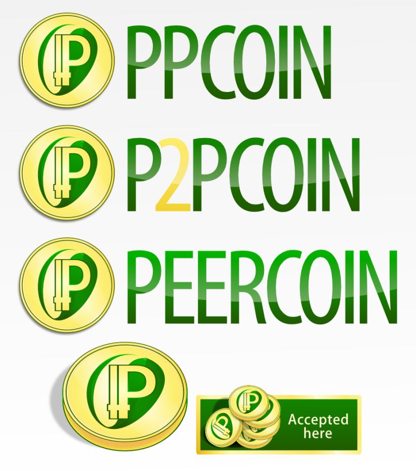
The only thing I would change is P2P to PP in the C. Personally I like the PPCoin name.
I’m also a huge supporter of the slogan: Redefining the nature of currency.
The “Amazon Coin” look great. I also support the gold relief look. I think it is kind of strange to add colours to a metall coin. I have made a consept coin that I thing would look amazing in the “Amazon Coin” look. I’m currently on a laptop without a mouse, so the quality of the drawing is very bad. Maby someone would like to transfer my consept into something like the “Amazon Coin”?


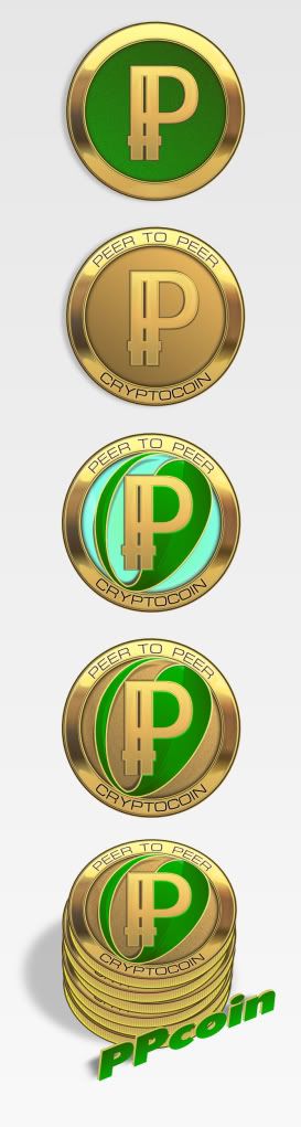
Here is a tweaked version of that just to connect the left P at the top and middle so it doesn’t look like IP. As I said on the bitcointalk thread, I’m blown away by this new design.
-
I agree and disagree with some of the things Excelsior said. I think you should probably lose the date. Since we don’t have physical coins that were created on a certain date, it doesn’t really make sense to include it.
-
I’m glad you spelled out peer to peer. I have the feeling that people get confused as to the meaning of pp and this would help clear up any confusion.
-
It is pretty hard to read cryptocoin. Maybe you could darken it up a bit.
-
I’d like to see the PP in the middle a more golden color as well. I’m not sure what it would look like though, so I’m just wondering. Also, I really believe we should drop the logo design that looks like IP. I think it’s just going to confuse people. We don’t need people going around saying they bought some IP coin.
-
PPCOIN under the logo is much too large. I would think about making it smaller such as the gray text in this link (http://i2.photobucket.com/albums/y17/Sentinelrv/Other-Images/ppcoinweb8.png), except dark green like what you have currently. Maybe just minimize that logo.
-
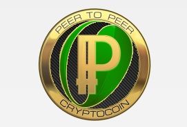
I very much disagree that we should remove the leaf design from the coin. The leaf is what conveys that the coin is eco-friendly. This is very important in separating ppcoin from the competition. I also disagree that we should make the coin completely golden for several reasons. First of all, cryptocoins aren’t physical, so they’re not completely made out of copper or other metals. This is the only reason physical coins are one color and the same rule need not apply to cyptocoins. The main reason though is that without the green, I most likely wouldn’t be able to tell that it was a leaf. It would just look like some random background design. It also helps break up the coin and makes it stand out. So please, keep the leaf to maintain ppcoin’s eco-friendliness and the green color.

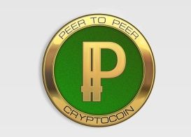
This is looking amazing. I see the point you make about having green inside the gold, and I’m happy either way we go. “PEER TO PEER” and “CRYPTOCOIN” is great. I also think “2012” is a good thing to incorporate. The only thing I’m missing is that we can see the loop of the aft P inside the hole of the forward P.
I guess we officially moved here, so this is a response to Excelsior’s post over at Bitcointalk…
I wanted to make sure my worries about the symbol had merit, so I did an experiment. I went around to everyone I know at my job and showed them the newer design and without telling them anything about the coin itself, I asked them what they thought the letters say. Every single person I asked told me IP. When I asked them if it looked like PP, they all said no. This confirms my fear about the symbol, so I think we should drop the IP design. Anyone is welcome to try my experiment to see if they get different results. The last thing we need is confusion on the logo.
Ok I’ll Probably throw a few numbered versions of the coin, maybe a case of a pick and mix,
the premise was taking a little of the amazon coin colours, shine , I’m sure the amazon coin was created in 3d then rendered etc. with light sources and shine effects… Anyhow it’s amazing seeing what’s possible , mines just vector shades that don’t get close really.
I’m sure sunny was the one that said no need to change what I called IP (not him) , I then thought it was some Unicode font or something
[quote=“BitcoinFridge, post:31, topic:76”]Ok I’ll Probably throw a few numbered versions of the coin, maybe a case of a pick and mix,
the premise was taking a little of the amazon coin colours, shine , I’m sure the amazon coin was created in 3d then rendered etc. with light sources and shine effects… Anyhow it’s amazing seeing what’s possible , mines just vector shades that don’t get close really.
I’m sure sunny was the one that said no need to change what I called IP (not him) , I then thought it was some Unicode font or something[/quote]
Realistically it doesn’t matter if it appears to be a PP or an IP anyway. What really matters is that a logo stays very simple and conveys some aspect about the product or company, that is to say, the benefits or value that a consumer/user will gain from adopting or using the company or product in question.
[quote=“Excelsior”]Yikes. Thanks for doing that! Then indeed we have a problem. Nice catch.
So then, how do we design an attractive “PP” for the coin?
What about layered somehow (showing both "P"s). Like a shadow effect of sorts.[/quote]
I don’t think we have any problem that needs fixing. Just use my tweaked version above instead. It’s not like it’s a major departure from the IP version. The only thing that was changed was the connection of the top and middle of the left P. It looks more like a double P that way. No need to change the whole design or anything.
I thought Sunny said this when people were trying to drastically alter the symbol. We had Chinese characters, then we had something that looked like cP, then we had a similar but wider version of the P with the cross higher up on the symbol. As I said above, my version barely changes anything except making the first letter look more like a P. It’s almost identical except for that.
Edit: I just sent Sunny a PM making my case and asking if it was ok for us to use it. Let’s see what he says.
[quote=“Excelsior”]I see. I didn’t notice the earlier version that clearly DOES look like an “IP”. The newer version seems fine to me.
But what isn’t clear to me now, is which version was this “test” done with - where people thought it said “IP”? It’s important to know.[/quote]
I did the test with the version BitcoinFridge posted. Everyone said that looked like it said IP. What I’m suggesting is to use my tweaked version, which looks more like a double P.

I don’t like the light blue one. Too “kitsch”. The brown one is fine, could be a bit more “golden” though. I also like the simpler design with only gold-green.
We’re getting pretty close to a consensus. I’m liking that design more now that it’s got some better shading but still think some of Detail3’s are great.
Perhaps in the next few weeks we’ll be ready to put up a poll. Preferably with first, second and third choice options.
There was another post which called into question weather there was need for an official logo. I tend to think there is though it’s not so important that 3rd parties use, just preferably that they stick to the style of "P"s used and perhaps ê (U+A750) to mark amounts in ppc. I still think â±£ (U+2C63) is nicer but I guess I’m in the minority.
I’m divided on these new ones. I know I don’t like the blue one. The all gold one looks too plain. For me, currently it’s between the one with the leaf and the one with the green background. I think I might still be leaning in the direction of the leaf.
What would the one with the green background look like with the text around the outside of the coin? It looks a little plain because that’s missing.
Here is the green one with the text on the coin…
And I was playing around with Paint and made this. It’s the same coin with a carbon fiber background. It’s not a serious submission. I thought it was funny, so I posted it.