This isn’t the case of diving straight onto the forum demanding a logo change, however I’m invested in peercoin and I believe that soon when the dust settles from the increasing number of alt coins they’ll be Bitcoin, Litecoin, and peercoin. I’ve thrown a couple of designs down so far. Anyone else have any ideas, suggestions ?


This is what my guys have so far. They really didn’t get it to start. Feedback/Direction for them?
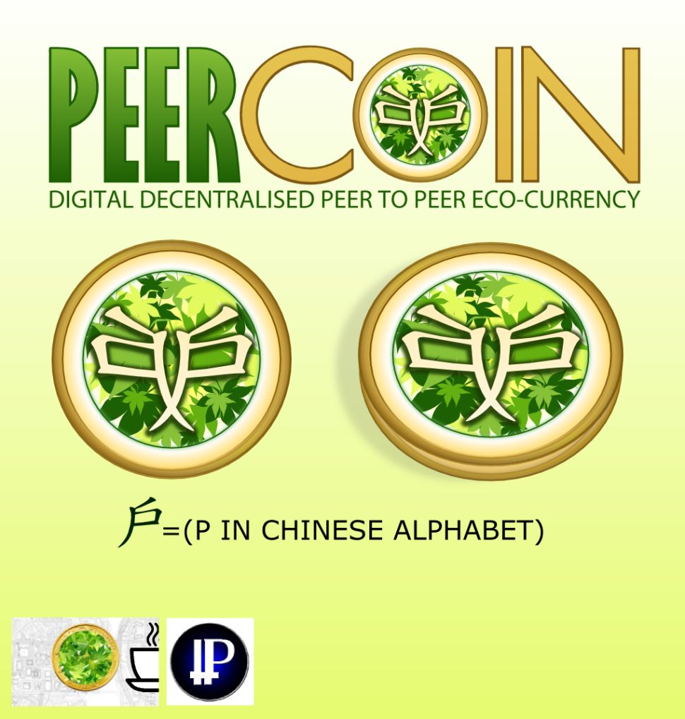
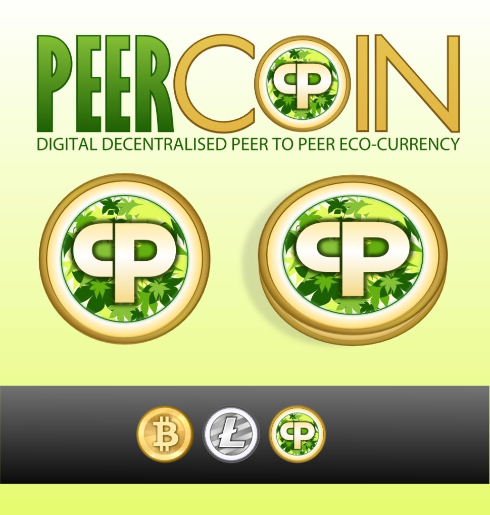
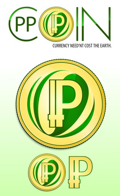
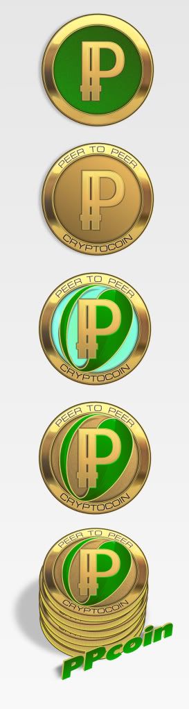
(I’m partial to the green one…though it looks sort of plastic right now).

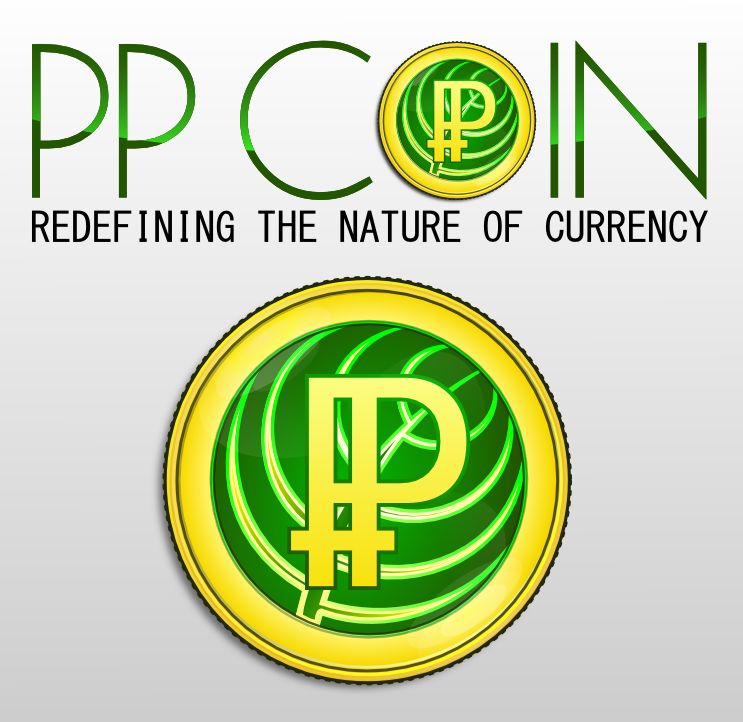
Good work , great to see more designs , Quite like the top middle (green one) also what font is the text PPcoin??I Think that looks a better font than my effort I’ve got a rather poor selection of fonts.
Thanks for the feedback Excelsior…and I agree with most of your points. I’ve actually told them to avoid using any text, ultimately if people choose they can add that later; what I’m looking for here is more of a branding symbol. I thought the stars were ‘American’ too, looked like a GI Joe symbol to me. I have no idea what font is used in any of them 
The bars connecting the P’s were from Sunny, so I had them keep them. Seemed as though it was something he wanted included. I actually kinda like it personally, though I see your point.
And the ‘candiness’ of the green I’m with you on…however I think that simplistic design is actually my favorite of them all. I’m going to have her try to make it more…emeraldy or jade like (yeah I made those terms up).
Sunny, any feedback on these? Do you like them? hate them? Want us to stop tampering with the logo?
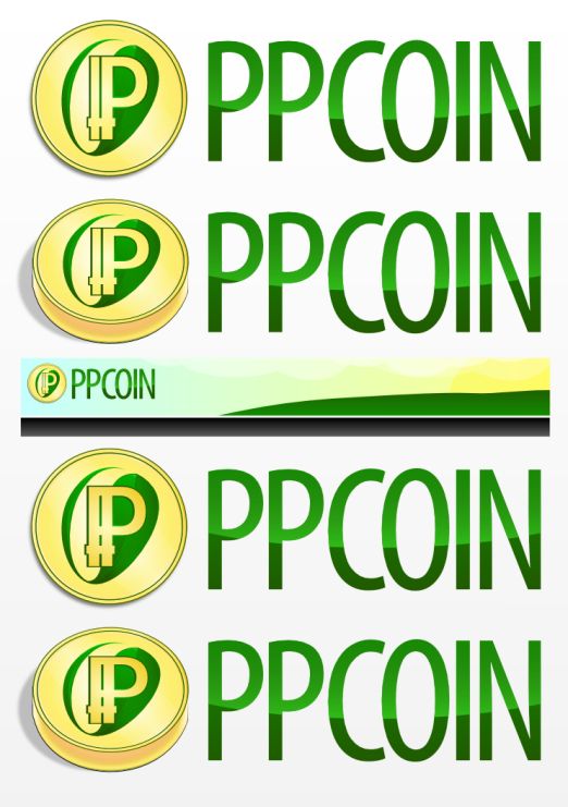
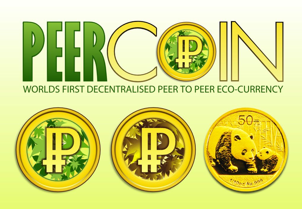
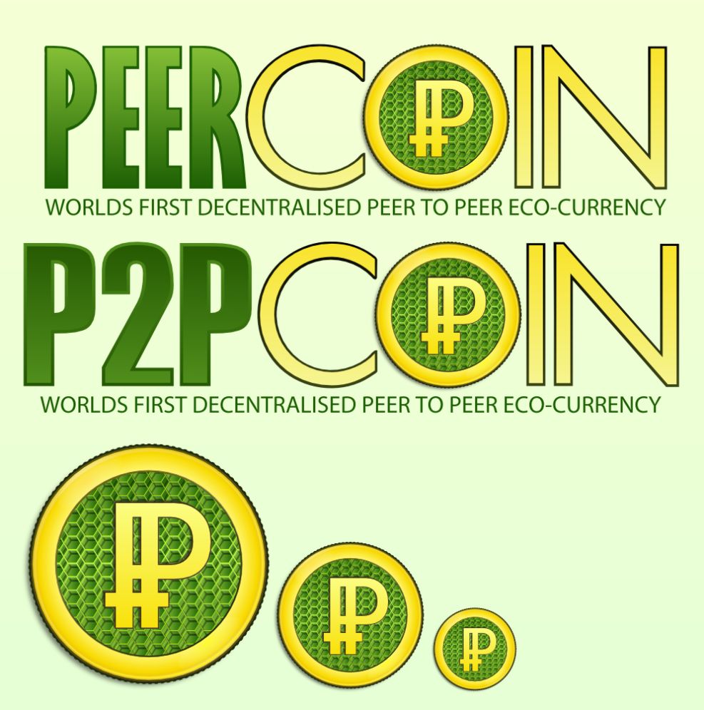
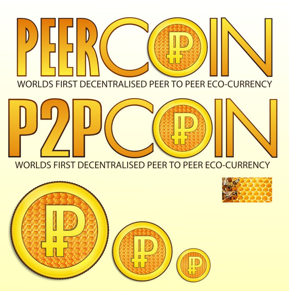
Some additional submissions


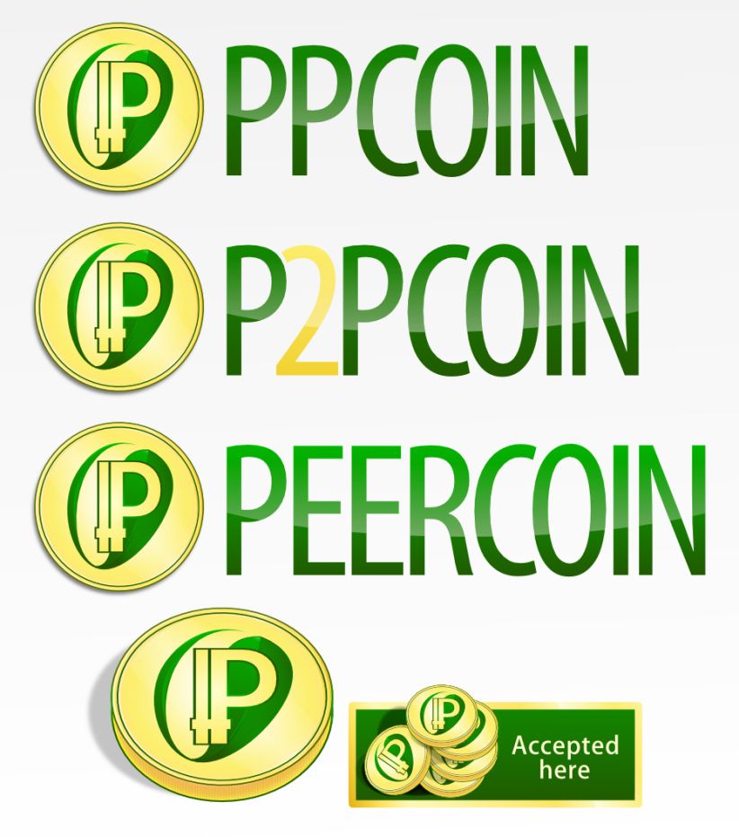
the one with the ‘scaly iridescence’? The ones that look similar to one another are done by the same designer (in all there are three, however the third designer hasn’t resubmitted yet).
As you can imagine, the feedback on this project is sporadic and all over the place, lol. People love ones that others hate, etc…

No man, I don’t know the first thing about design…I need feedback to give them.
^^ that one is my new favorite of yours Fridge. I also love that slogan a lot.
I like your designs. Just wanted to ask if it’s ok if I use the coin 2 posts up as my avatar?
No problem just bare in mind there’s no definitive new logo just throwing some ideas out there .
*Try and overlook my " ’ " in the last tag line ![]()

Yeah, I’m waiting on it…though it will have the world map in the background. It seems I should note, that support is moving towards bitcoinfridge’s design (my support is as well honestly).
I like a few of them, but ultimately its a community project and whatever more people want is what we should go with.