willy
February 21, 2019, 10:07pm
1
Regarding
Upgrade to PPC v0.7 killed mintr for reasons that I’m not entirely sure of.
Fixing the code would probably need more time than rewriting the chart section to a better performing product.
I will work on bringing back (most of) the charts mintr provided, but I can’t say when this will be done.
Hi community,
has some fancy charts now.
Implemented
Charts:
Coin supply
PoS diff average
PoW diff average
PoW/PoS block ratio
Block timing average
PoS minted daily
PoW mined daily
number of real transfer transactions (non minting or mining transactions)
number of ppc transacted in transactions above
active addresses minting / mining
annual inflation rate
Planned
Please post feature and chart requests here.
Buy me a gin tonic at PA3VZmupxdsX5TuS1PyXZPsbbhZGT2htPz
Willy
4 Likes
Nagalim
February 22, 2019, 1:36pm
2
Log scale on y-axis and customizable time ranges plz. Looks good on mobile.
1 Like
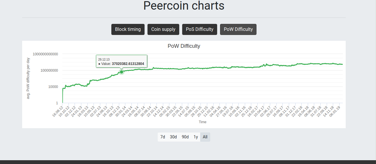
willy
February 22, 2019, 5:07pm
3
I have no experience with log charts, does this look alright to you?
(startpoint has to be 1 in high charts, otherwise it crashes)
Nagalim
February 22, 2019, 8:23pm
4
PoW difficulty is definitely the one where it matters (otherwise everything early on just looks like a flat line), and yes finding a good y-range is always a little bit of a challenge for log charts. Specifically, the lower bound usually needs to be floating for log charts to be useful. The upper y-axis bound rescales pretty well as I zoom in, but the lower bound is fixed.
For Peercoin, it’s not as big a deal honestly. You can see how it’s pretty necessary to really see what’s going on with Bitcoin historically in the following chart. They have the same issue here of the lower bound on their range on log charts, so maybe there’s just not much that can be done about it.
Anyway, I appreciate your fast turn around time. Always impressive.
willy
March 5, 2019, 8:17pm
5
Ported the chart library from Highcharts to Highstocks
Still some things to do, but we now have a range selector
1 Like
I think you broke something. Not working for me in Firefox, getting blank screens.
willy
March 8, 2019, 10:08am
7
Working again, sorry for the inconvenience.
1 Like
willy
March 10, 2019, 3:14pm
8
I’ve added that .
Looking for feedback.
seeing that you have no more future plans, here is the list of charts that would be helpful to have:
number of real transfer transactions (non minting or mining transactions)
active addresses participating in the transactions above
number of ppc transacted in transactions above
active addresses minting
active addresses mining
also, it would be very convenient to remember selected time period of the graph.
is it possible to have charts aggregated by weeks / months as well?
3 Likes
willy
March 22, 2019, 8:44am
11
Excellent feedback.
This is implemented now for the range buttons.
Can you elaborate?
i meant remember range chooser on the bottom of the screen if that’s possible.
willy:
is it possible to have charts aggregated by weeks / months as well?
Can you elaborate?
right now points on the graph are days, what i meant is ability to have points as weeks, so if you choose to see last year for example, you’ll have 52 data points rather than 365.
willy
March 25, 2019, 10:41pm
13
willy:
number of real transfer transactions (non minting or mining transactions)
number of ppc transacted in transactions above
active addresses minting / mining
Now implemented.
Thanks @backpacker69 for the request.
willy
April 19, 2019, 3:38pm
15
now implemented. Please test.
2 Likes
wonderful graphs, very good, thank you!
willy
May 12, 2019, 11:28am
17
Navigation changes now appear in the browser URL and are now linkable. Enjoy.
1 Like
willy
May 18, 2021, 2:01pm
18
as requested by @irritant https://peercoinexplorer.net/charts/powreward/0/linear/default
Go have a look and gaze at our all time PoW-reward lows
2 Likes