I’m not sure if I really like any of the ones that combine gold and silver to be honest, as David said the colors clash. But the gold on silver is probably the best so far. I would like to see what a new color scheme would look like, without either gold or silver. Maybe with dark gray/black, and white. I’ll try making some basic mock-ups now, but I’m not great at it.
Thanks, the gold on silver version appears more metallic to me than the original for some reason. Maybe that’s why I like it better. I messaged David to see if he still has the same opinion or not.
Your first instinct and original post was correct.
Gold Peercoin, Grey Peershares, Combined PeerUnity. I like it too. Run with this for now. My vote.
Although I like the appearance of gold on silver better, I recognize the silver on gold version for uniting the colors in the way I feel Peercoin and Peershares are united.
So I vote for the silver “P” on gold coin logo for Peerunity as the underlying coin is Peercoin and that has a golden coin logo…
Reading the comments above, it appears my opinion is in the minority so it doesn’t matter. I don’t like gold/silver as a combination at all for what it’s worth, they clash with each other and leaves us no room to introduce future Peer family innovations.
My vote would still be either original all-gold, something blank like white or black, or Ben’s idea above of just a gold P.
[quote=“David, post:25, topic:2226”]Reading the comments above, it appears my opinion is in the minority so it doesn’t matter. I don’t like gold/silver as a combination at all for what it’s worth, they clash with each other and leaves us no room to introduce future Peer family innovations.
My vote would still be either original all-gold, something blank like white or black, or Ben’s idea above of just a gold P.[/quote]
Alright, about the white or black version though. I’m not sure if they would work because they would need to be put up against a light or dark background. I’m imagining a white logo being put up against a white website or a black logo being put up against a black website. I don’t think that would work would it?
Lol… there’s a certain poetic justice if this was the logo:

“Peercoin, the original black coin”

My thoughts on the options as follows:
Not at all keen on the inverted colours (silver P on gold / gold P on silver), as this requires people to “decode” the inverted colours. Psychologically, this can be a barrier. Better to have a dominant colour for each brand
Not keen on the split half-gold/half-silver coin for peerunity. The key word is UNITY. Again, I suggest we need a dominant to represent unity
Funnily enough, I was thinking of solemn black when Ben posted the black logo
peercoin - gold
peershares - silver
peerunity - black (but with a gold P)

That’s getting there, river. I meant mine in jest, but I like the gold rim / black inner / gold “P” look.
Lol, that would be funny. But on a more serious note, if it’s going to be split like this with everybody having different opinions, then I’m going to have to agree with David here. As I said earlier, the gold should be the dominant “Peer Family” logo that is associated with all the major Peer Products, whether it’s Peercoin, Peershares or something different that comes in the future. While each product might have its own color, the gold logo should be associated with all of them, the entire “Peer Family.”
At the current moment, Peerunity is a merging of Peercoin and Peershares, but more programs will be merged into it in the future as they’re released. That means the gold/silver logo will become outdated. If the gold really encompasses the entire “Peer Family,” all of them united under one logo, then I believe it makes sense that Peerunity should be represented by the gold also. I think this is going to be my final opinion on it. It feels right to me from a marketing standpoint.
[quote=“river333, post:31, topic:2226”]I just edited it a bit more
[/quote]Actually, this could be a possibility! I don’t see what you’re talking about with dark gray. It looks black to me, but that makes sense. If you think about it, when you mix a whole bunch of colors together, it turns black. It’s like a unity of all colors, Peerunity! I turned down the black idea a little bit ago, but I hadn’t thought about keeping the outer ring and the P gold. I was thinking the entire thing would be black. This really makes sense to me though. What do others think? I could have Lightning make us up a better version.
I like it. Black is strong and distinctive (better than grey, which might be confused with silver for peershares)
The gold rim and P is classy and provides continuity with the original gold peercoin logo
[quote=“Sentinelrv, post:33, topic:2226”][quote=“river333, post:31, topic:2226”]I just edited it a bit more
[/quote]Actually, this could be a possibility! I don’t see what you’re talking about with dark gray. It looks black to me, but that makes sense. If you think about it, when you mix a whole bunch of colors together, it turns black. It’s like a unity of all colors, Peerunity! I turned down the black idea a little bit ago, but I hadn’t thought about keeping the outer ring and the P gold. I was thinking the entire thing would be black. This really makes sense to me though. What do others think? I could have Lightning make us up a better version.[/quote]
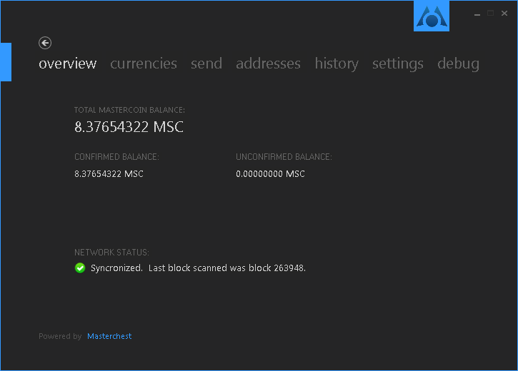
Haha, well I meant a lighter shade of black then, as opposed to the more solid black from before…or maybe I’m just color blind! We could actually go with a dark theme for the whole wallet. I posted it before but I really like Mastercoin’s one, maybe ours could be similar.
I think that could be one option, but I agree with Cyb that having a “light” option is a good idea, too.
Readability often suffers on high-contrast UIs.
I really think you hit the nail on the head here. It just makes sense. I’m going to contact Lightning and have him make up a dark gray and black version to see what they look like.
[quote=“Ben, post:36, topic:2226”]I think that could be one option, but I agree with Cyb that having a “light” option is a good idea, too.
Readability often suffers on high-contrast UIs.[/quote]
I agree that there should be different theme options and not just one.
Great! Although I am a bit offended that you don’t think my crappy paint version is good enough ![]()
Great! Although I am a bit offended that you don’t think my crappy paint version is good enough :P[/quote]
Lol, I’ve actually had this same idea before when I was trying to figure out the Primecoin logo. I made a version in paint as well, but it looks even better with Peercoin in my opinion…