Peerunity v0.1.2 (Release Candidate, 1) is now available

Repository:

Direct links to binaries:

[ul][li]peerunity-0.1.2-RC1-win.zip (md5 = 82c6b9c7dc7e628e98f8863527359313)[/li]
[li]peerunity-0.1.2-RC1-linux.zip (md5 = c9c828fc39825cb21044f844c6f5126a)[/li]
[li]peerunity-0.1.2-RC1-osx.zip (md5 = e3f115df60439bb127e508635803a984)[/li][/ul]

Notable features:

[ul][li]Change is now correctly sent back to the wallet when “-avatar” mode is enabled.[/li]
[li]Optional virtual keyboard for added security while entering the wallet’s passphrase.[/li]
[li]Introduction of a multi-signature GUI screen (located under the “File” option in the menu).[/li]
[li]Miscellaneous defect fixes for coin control, the minting tab, and the general user interface.[/li]
[li]Updated translations provided by the community (includes all changes added to the Peerunity project on GetLocalization until December 1, 2014)[/li][/ul]

Should you run into a problem, please report the issue on the Peerunity Github project or here. The final v0.1.2 release will be readied once we’ve had a chance for the early adopters in the community to provide their feedback on the release.

Thank you to all of the contributors:

[ul][li]GLV2[/li]
[li]SigmundAlpha[/li]
[li]SigMike[/li]
[li]Sandakersmann[/li]
[li]Coingame[/li]
[li]thokon00[/li][/ul]

Nice, thanks.

“Optional virtual keyboard for added security while entering the wallet’s passphrase.”
—> more secure by the day, and user friendly.

Thank you. The community is making solid progress.

Great news!

Ben, do you know how the theme change is going? I know you were looking into it back during Summer and SigmundAlpha had posted some screenshots a while ago as well, but I haven’t heard anything since then.

Well, Sentinelrv, I started on it, but the best I could do is skin the interface, I couldn’t get a decent window decoration going without overwriting quite a few Qt Classes, so I dropped the initiative.

Are you referring to the issue with making the gray menu bar disappear? Even the NuBits client has that bar at the top. Maybe I can just alter the current design a little bit to include the gray menu bar and we can work on removing it at some point in the future. At least we’d have a theme that’s 90% finished.

No, I’m talking about window decoration. Like the window border? I thought you guys wanted that custom?

So you’re talking about the yellow line that goes around the window? Is that it?

Ok, I talked to SigmundAlpha in chat and now I see what he’s talking about. Here is the chat log…

SigmundAlpha: Do I have this write? You want theme support regardless of it’s ability to skin the window frame?

Sentinelrv: I’m not sure what that means.

Sentinelrv: Were you saying that the problem you were having was the yellow border around the window?

SigmundAlpha: You use MS Windows right?

Sentinelrv: Yeah

SigmundAlpha: No, I’m talking about the frame: The title bar, action windows, and resize frame.

SigmundAlpha: It’s the same on (almost) all your application?

Sentinelrv: So on the client you’re referring to the title bar, Files, Settings, Help, Minimize, Maximize and close?

SigmundAlpha: Nope, I can skin the menu bar (I think), just the title bar and and frame (the think you click and drag to resize the window)

Sentinelrv: Is it possible to take a screenshot of what you have so you can point it out to me? I’m not understanding.

Sentinelrv: I also need to shut down the computer because I’m leaving work. Sorry, I’ll be back on in maybe an hour to see if you posted back.

SigmundAlpha: Ight

SigmundAlpha: https://imgur.com/gp9k3nG Everything highlighted in red can not be changed from the Qt end of things. (There is a 1px border around the whole windw that is read, by the way, it just hard to see because of how my system is set up)

So here is his image…

Here is how the same client looks on my laptop…

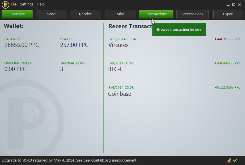
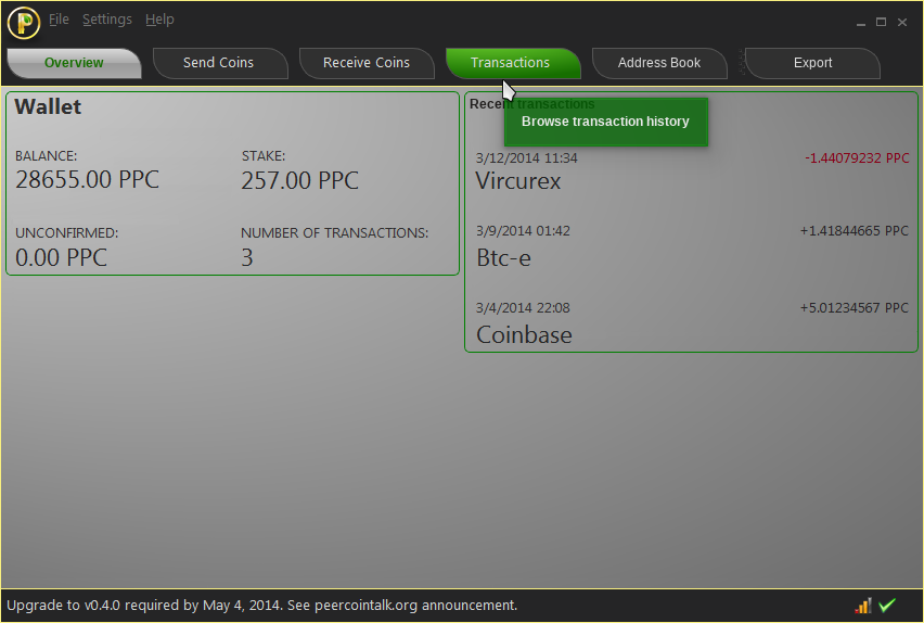
And here is how the concept art I made looks…

Looking at these images, I now see what he’s talking about. I never thought about the outer window when designing this. I’ve seen other programs that got rid of the outer window somehow, for example the Mastercoin client that this was based off of. It seems that this must be too complicated to pull off, so I altered the design. This new design should be easier to make. It also takes some inspiration from the NuBits/NuShares client by adding in the icon and text logo in the upper left with the buttons to the right. Is this easier to create?

Hi Sentinelrv,

Could you link the topic where you submitted this concept art proposal?
I would like to discuss about it :slight_smile:

Thanks.

[quote=“Thireus, post:11, topic:3132”]Hi Sentinelrv,

Could you link the topic where you submitted this concept art proposal?
I would like to discuss about it :slight_smile:

Thanks.[/quote]

Check this Peerunity board. There are several threads I created to discuss it. There is also a thread not created by me about ideas for v0.2 where it is discussed some as well. It has been a long process, but I was able to get to a point where most people agree with the theme change.

Ok, since I cannot find your post among the 2207 posts you submitted on this forum (pretty lame of me heh I know…). Here are my remarks about this theme:

Good stuff:

  • The background design is great, the buttons, logo and color palette too (the header part is very good).

Could be improved:

  • The mouseover helper box is way too big, the paddings should be smaller and no borders, also the green color should be changed with a bit of transparency.
  • The space between recent transactions is too much. Unless we can only see a max of 3 transactions… In which case I would suggest changing this max limit.
  • I’m not 100% convinced about the font used on the main page (header is ok), looks a bit unprofessional and not financial related to me.
  • The blue background should be beige or brighter, (green and red fonts on top of blue are a tiny painful for our eyes).

Very nice design and colors.
What i would like to see also are:

  1. in the column of “recent transactions”
    to be able to see more transactions, not only 3. The bigger the peercoin window, the more transactions to show.
  2. in the left column below “wallet” to be able to see other info about ppc (like difficulty, market value, trx fee, etc)

Sorry, maybe I wasn’t clear. I only meant the threads on the Peerunity board, not the whole forum. There are only about 2 pages worth of threads in this board, which should be pretty easy to go through. I’ve linked to all the related threads below though so you can read up on the process we went through…

I used MS Paint to create these images, so I’m limited in what I can do. As you go through the links above, you’ll see that this design is not final and that things are missing. For example, the green pop up box is supposed to be transparent, but I don’t know how to do that with Paint. It’s supposed to look like the pop up box in the following image. Just imagine that box is over top of my design…

This is only a design. The amount of transactions on the window should be whatever the Peerunity client supports. There is a lot of space horizontally as well. What’s missing in this design (because I had trouble putting it in there) are the dark gray send and receive icons that show up under the recent transactions column. Again, just mentally add them in.

All the font on the page is the same except the Peerunity text logo. The font in the header, footer and middle section is using Segoe UI.

The background is supposed to be light gray, not blue.

This is up to the Peerunity developers to add in. This only shows off the design, not extra features or display information.

You should get Paint.NET. It is open source and free.

http://www.getpaint.net/

Hmm, it looks that we have another design thread. Maybe best to keep design discussion in another thread on Peerunity board? Thanks.

Anyway, thanks Ben, for compiling the lot, will have a test run.

Sure, just removed my post.

Very exciting to see the new version and I don’t know how to use the multi-sig feature. Is there a tutorial or a link?
BTW, the multi-sig translation?

Since no one uses Peercoin client to mine, I don’t see the point of producing peerunity 64bit binaries, at least for windows. It increases download volume by about 100%.