I know a talented designer/techy who could be happy to have a go at this, and perhaps further things (I’ll pay him in beer to begin).
What were your guidelines to the previous designer? Is the Psi required? I’m not aware of a connection with primes, in fact I’m not aware of any specific symbol for Primes. I like the spiral idea.
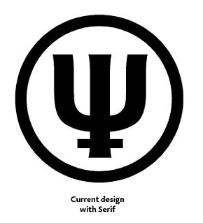
Yes, the psi has to be included. It’s the main symbol of Primecoin chosen by Sunny King. It also needs to have the line through it at the bottom, indicating it’s a currency symbol. Here is Sunny’s reasoning for choosing it…
Also, read Sunny’s response earlier in this thread.
OK, here are some ideas for Primecoin logo, from my friend hp (with a bit of help from myself). The thought was that the basic square Psi symbol doesn’t really capture the classic Psi, and is missing a bit of interest for a more detailed coin. He’s included a Sack’s spiral - a variant of Ulam spiral - as the background, which fades out if the image is down-sampled. The basic designs are here: http://imgur.com/p82eUMN and more detailed ideas can be found here: http://imgur.com/7oZS5Fq
I think they’re nice: quite distinct and somewhat mathematical and mysterious. What do you think?
I actually think the background of the coin with the spiral looks pretty cool, but I don’t particularly like the symbol used. Can we see something similar, except using the following symbol with the slightly curved tops and bottoms? The outer rim would also need to be completely solid like in the image below. Can we have some variations of this that don’t include any crazy colors like red and blue? Also, is there anyway to post a higher quality version? These ones seem to be kind of jagged looking.
[quote=“Eugen, post:28, topic:419”]Sure: I tend to agree on the shape. So you mean something like the serif shape in the gold colour?
The pdf seemed to be downsampled in imgur - I’m not sure of the simplest way to post it.[/quote]
We were talking last night in chat and it might be best to include black in the design. I might have my designer try some things out. Here is another one at different sizes…
[quote=“Sentinelrv, post:29, topic:419”][quote=“Eugen, post:28, topic:419”]Sure: I tend to agree on the shape. So you mean something like the serif shape in the gold colour?
The pdf seemed to be downsampled in imgur - I’m not sure of the simplest way to post it.[/quote]
We were talking last night in chat and it might be best to include black in the design. I might have my designer try some things out. Here is another one at different sizes…
[/quote]
This one looks the best to me. I think the color needs to be fixed though… Not digging the 3D stuff. (personally I really feel like the peercoin logo is really tacky with the gradient…)
If you look at other major coins, they all have a 3D version and a solid colour version - I think both are important in different contexts. The solid colour one is usually very simple (I think the current solid primecoin logo is good). The last couple of suggestions seem a bit too half-way for me - I think there needs to be some detail in the black areas.
I’d not seen the gold metallic logo on the Facebook and Twitter pages: considering the page has been approved by Sunny, why not use that logo here for now?
While I have to admit that the latest design in this thread (the blue one) is very good, I sort of miss the golden “coin-like” touch.
It look more like a logo or an emblem than a coin to me. But pretty nontheless.