Homepage Marketing Improvements

I’m creating this is a thread because I think the marketing content on the https://peercoin.net/ homepage can be better.

With a plethora of competing currencies popping up everyday it’s important that the homepage gets the selling points across as quickly as possible.

Please go to the site and pretend you just heard about Peercoin, what is difficult to understand or missing altogether?

To kick things off my notes are:

A. Banner Header

I think we should get rid of it. It takes up unnecessary space, the logo and name should just be in the top left corner in the nav bar. This will also create space and emphasis for point #2

B. Why Peercoin

Peercoin is the most secure, decentralized, and energy efficient cryptocoin. Instead of relying on a small number of powerful miners, the network is secured at very low cost by ordinary users. And everyone who participates is rewarded for strengthening the network by receiving a 1% annual PPC return through minting.

C. Highlight bullets

Beyond Bitcoin
The world’s first Proof-of-Stake coin.

??x More Energy Efficient
Low-cost minting on any device.

Stable and Secure
Protecting your investment since 2012.

Fair Distribution
No insider pre-sale or instant mining.

Looking forward to hearing other people’s notes!

2 Likes

The main website has been in dire need of a makeover for a while now. It’s one of the last holdovers from before we updated our image. We weren’t in a position to change anything though, so we just updated to the new logo without changing any of the content. It’s coming time though that we need to tackle this.

I agree with this. What I want to do is make it similar to what we have on the forum here, put the gray header at the top with the logos on the left and the navigation on the right.

The banner below the header would be gone and it would instead dive immediately into the content. Peercoin’s original animated YouTube video would also be gone. It still uses the old logo and it’s just outdated at this point, plus I think it doesn’t do a very good job of selling the network. People lack time, so there is a lot more resistance to watching a video. We want most of the good information visible right there on the home page without needing to do something extra like clicking to watch a video.

My present idea (without viewing competitor websites yet) is to list a certain number of main ideas one by one in a row where Peercoin shines. For example, first thing could be an overview of what the network is. It would include a larger title, a paragraph of description text to both explain and market the concept to the viewer as well as a visual aid such as a design or animation to help convey the idea visually.

Next could be sustainability, then governance, then security, then PeerAssets, etc… Each main idea would have its own little section informing the viewer why it makes Peercoin so great.

Also, currently we split everything up into multiple pages. Almost nothing is listed on the home page and we force the user to check the navigation or click a button. Instead we would be laying everything out on the home page, all the various things that make Peercoin a great blockchain and what it can do for them. We currently lose viewers for every single page that they’re forced to click on, so a one page design will help prevent that and ensure the most important content will be read.

Now there is also another part to this in my mind. Peercoin is not simply about marketing hype like other projects. We want people to learn and actually understand Peercoin. Before we tackle redoing the website, we wanted to get our new wiki up and running. @kazzkiq is currently working on converting the software he used to display the PeerAssets white paper into wiki software that we can then theme and put to use.

What I eventually want is a long wiki that goes from an introduction stage, to the basics and then more advanced information. The software is designed so that the entire wiki is on one page and the chapters in the navigation adjust automatically as you scroll down the page. I wanted this to be like a big book on Peercoin that takes someone new and walks them through the entire thing.

Looking back to the home page of peercoin.net, as I said each main idea would have a short paragraph of text designed to market the concept, however at the end of each text I believe there should be a link to learn more. That link would take you to the specific page in the wiki where that exact concept is talked about in depth.

So the purpose is to provide a quick overview on the home page of all the different things that make Peercoin what it is. These should be designed to both inform the reader and catch their interest. This may be enough to get somebody to invest, but for those curious or more advanced users who want to learn more, we provide a main resource in the wiki that can further explain all the concepts listed on the home page. This way we’re providing something for both types of people, the newbie as well as the regular crypto user or even the developer. The home page is designed more with marketing in mind to convert viewers, where the wiki is more for education, but can also be used to convert those who seek more information on how the network functions.

As I said though, I still need to make time to take a look at the websites of our competitors to see if we can gather more ideas, plus Kazzkiq needs to finish the wiki software first before we can start writing and organizing content for it. These were just my initial thoughts on what could be done.
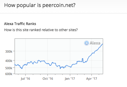
2 Likes

I think all those ideas are great.

However, was more thinking of quick changes we can make to the copy and implement right away to capitalize on the current boom / press cycle. Also, the interest in CASPER will spill over to Peercoin.

2 Likes

I just thought I’d share this page that I think matches these ideas and something similar for the homepage would look really good: Environment - Apple

I’m not suggesting we emphasise the environmental side, that’s just a coincidence. I also don’t really like the hand-drawn style of the animations, but otherwise think it would suit Peercoin’s branding. It looks slick but less flashy and obnoxious than other crypto’s websites.

2 Likes

@river I agree, but I also think we should put the environmental consciousness front and center - the green wave is still one of the biggest things happening right now, millions of people have put tons of energy and billions of dollars building it - I think we would be crazy not to ride it.

I know this is important to you, but the problem with this is that it’s not completely true. Peercoin is a hybrid, which means we still have PoW mining and so far we don’t ever plan to phase it out. The only reason for the leaf imagery is to get across that Peercoin’s security is not dependent on mining farms and energy expenditure. It is there to show the low cost nature of keeping the Peercoin network operating. Peercoin itself is not entirely energy efficient, but the security process is. Further, it appears that nobody in crypto cares that much about this because Peercoin’s main message has been that it’s energy efficient for some time now and it hasn’t caught on.

People are more interested in stuff like governance, DACs, smart contracts, etc… They are interested in things that immediately impact them directly and financially. Energy efficiency is great, but it’s not something that impacts their wallet immediately, thus people have less concern over it. We will need to talk about sustainability, but I think the explanation should be geared toward the low cost of sustaining the network, rather than being green.

By the way, @river the way that website is setup is something like what I had in mind, however I’m not sure about the real life photos and hand made drawings. We would need something better than that, which we can figure out by looking at some competitor websites to get ideas.

1 Like

Right. That post was before I understood the audience we’re seeking to attract.

However, for the future, I don’t think the coin has to be completely green in every way for us to push this aspect - it just has to be a marked improvement over the others.

@Sentinelrv I think we could see a relatively large payoff with very little work just by replacing the banner with the new tagline - strike while the iron is hot…

1 Like

I’ve noticed a few other crypto websites using real life photos. I think the reason is to show it as something practical that can be used instead of an abstract thing on the internet. It might be hard to find the right photo though.

I like the idea of using real photos/videos, too. While I do not think it should be used in most parts of the new website (animations and illustrations would fit better), I do think there should be a section somewhere with videos from “real” folks explaining a little more about it, images showing Peerbox nodes, etc.

(Sadly, or not) Humans talking to humans seems to give a product more “credibility”.