Future Web Development - Appearance & Visual Style

[quote=“RobertLloyd, post:39, topic:2499”]The image of the front page linked above is very wide. I cannot see it all on my screen without moving the scroll bars left and right.

Is that the width the end product is intended to be? If so, I do think it needs to be narrowed[/quote]
This is just an SS from my local testing server, just to save myself the hassle of uploading it to a server. It will be responsive as it is now…

I agree. The bottom of the page is the foundation, “the solid block that the page is resting on”. Right now we have the heavy solid thing, resting on top of a green light thing - I think that’s why it feels unbalanced. Its the opposite thing you want to communicate about a stable coin that is taking the long term view.

I went to art school for two years. I could probably go on and on nag about things all day long. If we’re really lucky, we never finish anything at all. I just added this comment, to show my appreciate of your work by participating with constructive critique. The thing is, you guys are actually doing something here and making progress. And I think you are doing a great job.[/quote]

So maybe the bottom of the website should be the dark gray color, while the upper parts use more white, green and gold? That sounds like a more solid foundation according to your comment.[/quote]

I guess that would be better. I don’t know how it would affect the rest of the design.

I kind of like the http://peershares.net/ design and how the colors of Peershares is reflected in clickable widgets (buttons, links)

In Peercoin we have the yellow thing, which I’m not sure of how to incorporate. Yellow is really difficult to see against something light like white, but yellow on dark grey is another story. Yellow on black, is actually the strongest contrast colors there is. Maybe the design could leverage that fact? (http://media-cache-ec0.pinimg.com/236x/db/e7/24/dbe72446dcb277d8b17bbf0b51203d61.jpg)

Since yellow and black would be really intense (in nature its a warning sign), the green could be used to perhaps smooth things out and bring some freshness to the whole thing. It could end up looking like this if we’re not careful (http://cssmayo.com/content/uploads/2010/09/4.jpg). But it doesn’t have to it could also look more like this (http://www.noupe.com/wp-content/uploads/trans/wp-content/uploads/2010/09/designzillas.jpg).

Oh-no, just as I suspected… if you listen to me you will never be finished because I will never be satisfied. Not with my own designs as well. (That’s why I never got a tattoo)

EDIT: Another example of how to work with grey and yellow: http://fc08.deviantart.net/fs70/f/2010/018/2/2/228c91479f71e50d0c2ce83b82be88e2.jpg and with some white in it as well http://designmodo.com/wp-content/uploads/2011/09/429.jpg

I will take a look at all this in the morning. I believe the next mockup should be a bit closer to what you are looking for, it is shaping up pretty decently.

I’m not sure I like the yellow in there either. I understand we have gold in our color palette, but that’s usually limited to our logo. The way I envision the website, it should be mostly white and green, with minimal amounts of dark gray added to it, mostly in the footer, maybe even in the header, similar to http://www.peershares.net (Though the page would be longer, so you wouldn’t see as much dark gray). I think the Peercoin logo looks best behind a dark gray background (Rather than white), but there shouldn’t be too much dark gray (I’m starting to agree with Cybnate on the darkness). Like I said, I think it should be mainly white and green, with minimal amounts of dark gray. I’m starting to see the two dark rectangles that cut across the screen as distracting as well.

@TheWildHorse, here is the latest version of the Peerunity theme we’re designing. Maybe it will give you some inspiration. It’s exactly what I’m talking about, mostly a light or white color with green and a minimal amount of dark gray…

The yellow/goldish was only added because it was the only color that somewhat fits with the theme that was eye-popping in that layout, will try to get it removed tho if you wish.

Sentinel, is it possible to split this thread between “Future Web Development - appearance and visual style” and “Future Web Development - content and themes”?

The topic has been split…

Future Web Development - Content & Themes

Update on the header. Please note that I do not like the coloring as it is now, I have some brainstorming to do on that fact. I’m kinda stuck in my own box right now, and have a hard time comming out of it and getting this thing sorted in a more elegant fashion.

Anyways: http://igor-rinkovec.from.hr/peercoin/

[quote=“TheWildHorse, post:48, topic:2499”]Update on the header. Please note that I do not like the coloring as it is now, I have some brainstorming to do on that fact. I’m kinda stuck in my own box right now, and have a hard time comming out of it and getting this thing sorted in a more elegant fashion.

Anyways: http://igor-rinkovec.from.hr/peercoin/[/quote]

I’m going to work on a concept image based on this. I’ll post it when I’m done, not sure when that will be though.

Can you please tell me what font you’re using?

[quote=“TheWildHorse, post:48, topic:2499”]Update on the header. Please note that I do not like the coloring as it is now, I have some brainstorming to do on that fact. I’m kinda stuck in my own box right now, and have a hard time comming out of it and getting this thing sorted in a more elegant fashion.

Anyways: http://igor-rinkovec.from.hr/peercoin/[/quote]

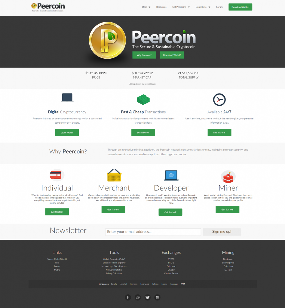
Ok, first of all I want to give you my feedback on what you posted there. I really like what you’ve done by adding the dark gray to the footer. It makes the page appear to have a better foundation, as Pillow talked about. In your first concept image, I said that I didn’t like the horizontal rectangles that went across the page and that they were highly distracting. When I checked your new version here, I noticed only one rectangle remained at the top and the rest had been turned a very light color. It seems my main problem with the previous version was that there were multiple dark rectangles. It made the page look like it had dark and white stripes. Now that there is only one rectangle in the header, it looks completely fine to me. I don’t like the dark green color of the upper rectangle, but you already said it would be changed anyway, so that shouldn’t be a problem. I also don’t like animation on websites, not even on the Peershares website where the logo swoops in from the side of the page. I wish they were both static images.

Now, I spent the entire night trying to improve your version. Please read my list of changes below. There are some important things that might need further work…

1. First of all, I did not change the content of the 3 information points. That’s something we still need to work on, so I left it as it is until we figure out what we want to change them to.

2. I added 3 “Learn More” buttons under the 3 info points, so that we have more green on the upper part of the page. Visitors can also click these buttons to learn more about these particular features.

3. I changed all the green buttons on the page so that they are consistent looking. For some reason there were two types of green buttons, but they’re all consistent now.

4. Only light green works with Peercoin’s color palette, so I was forced to change the header banner from dark green to the same dark gray that is used in the footer of the page. I think it looks much better.

5. I changed the icon logo to one that has the dark shadow below it. I think it looks nice on the gray background.

6. I removed “Secure. Sustainable. Peercoin is Here.” because people were confusing it for our marketing slogan, which is actually “The Secure & Sustainable Cryptocoin.”

7. I replaced it with a much larger lighter version of the Peercoin text logo, followed by our marketing slogan directly underneath it. I was hesitant to do this, because the top navigation header already has the Peercoin icon and text logo on the left side. It may look a little redundant when you first load the page, but once you scroll down, the larger text logo on the main banner vanishes, but the one on the main navigation follows as you scroll down the page. I actually don’t like the two logos in the navigation, because they’re shrunk down so much, they look a tad distorted. I don’t mind there being two sets at the top of the page, but if for some reason one set had to go, I would choose the logos in the navigation to be removed, so you can make room for more important buttons. I think the large icon, text logo and marketing slogan should stay over the dark banner no matter what.

8. I added two green buttons under the marketing slogan on the dark banner, one that takes you to the client download page and one that says “Why Peercoin,” which will move the page down to the 3 info points below, so the visitor can read about the features.

9. Another new addition is a place for the market cap, price and total supply counters, which I included directly below the dark banner with the logos.

10. That’s all the changes, but I read you want to work on the main navigation to include the different languages in a drop-down box. I have a suggestion for this. In the drop-down box, I believe you should include tiny flag icons that are visible without even having to click on it. The reason for this is because if you are Chinese and English is currently selected in the drop-down box, the Chinese visitor might not know it says “English,” because he can’t read it. He or she then ends up missing the drop-down box entirely, never knowing that they could change the language to Chinese. If you did it the way I’m talking about, if English is selected, there would be a tiny little American flag visible next to the word “English” in the drop-down menu, so foreign visitors will automatically know they can use it to change the language.

11. The only other thing I’d like to see changed if possible is for the social media icons to be moved to the top of the page on the navigation. This is the most highly trafficked area, so visitors will be able to like our Facebook page, follow us on Twitter and subscribe to our subreddit. Many people don’t go all the way to the bottom of the page, so these important icons are pretty much in the worst spot possible. One way I can see them being added to the navigation is if you removed the two logos to the left, like I mentioned above. Removing them would make extra room. Another option might be removing the download button to the right of the navigation and placing the icons in its place. There is already a download button on the dark banner when you first load the page. Here is what our page used to look like. They were in the correct spot back then. Maybe you can think of something.

Please tell me what you think everyone! :slight_smile:

Full Size: http://i2.photobucket.com/albums/y17/Sentinelrv/Other-Images/PeercoinnetRedesign1.png~original
good job, I like it.

Can someone please clarify something?

Is the eventual design going to be icons alongside each other (horizontally) as in this image:
http://i2.photobucket.com/albums/y17/Sentinelrv/Other-Images/PeercoinnetRedesign1.png~original

Or are the icons going to be going down the page, one after the other, as in this link:
http://igor-rinkovec.from.hr/peercoin/

@Sentinelrv
i like the fact that it’s looking less cluttered - nice work. i would prefer mono-coloured icons personally though - probably black/white vector art. i think this would make it look smarter in a similar manner to how the social icons at the bottom work.

Sentinel & Wildhorse

At the top of the page, to the right of “Forum”, can we insert a link “Newsletter”, leading to the email form for joining the newsletter list? At the moment, the newsletter invite is down the page - it ought to be at the top

Under Sentinel’s version of the webpage, is it possible to put the headings (e.g. “Merchant”) to the right of the symbol, rather than underneath? Otherwise, it gets a bit elongated, and the symbols, title, “get started” buttons and text get a bit jumbled in the mind

Also, I have been meaning to suggest this for ages: can we please remove the exclamation mark from “Download Wallet!”

@Sentinelrv
sorry, also do we need the icon image in the top left now that the header looks like it does…? may make it look even smarter/more uncluttered with just navigation at the top.

[quote=“RobertLloyd, post:54, topic:2499”]Can someone please clarify something?

Is the eventual design going to be icons alongside each other (horizontally) as in this image:
http://i2.photobucket.com/albums/y17/Sentinelrv/Other-Images/PeercoinnetRedesign1.png~original

Or are the icons going to be going down the page, one after the other, as in this link:
http://igor-rinkovec.from.hr/peercoin/[/quote]

The first link is the image I made. The second link is a live page. Are you viewing it from a mobile device? If so, you’re most likely being transferred to a mobile version.

Very nice!

Is it possible to move the “Why Peercoin?” question higher, so it is immediately under (or part of) the “Peercoin is here” bar?

I suggest this because visitors need a reason to be interested in Peercoin - and so answering the question “Why Peercoin?” ought to be one of the first things they see