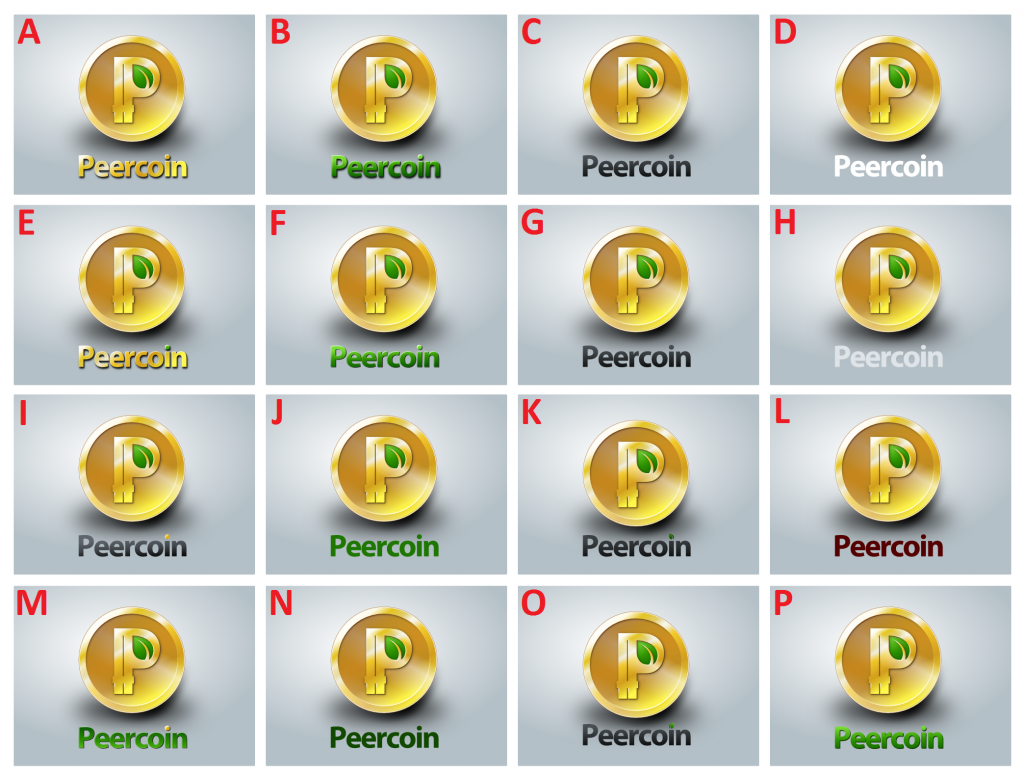
In the first round of voting we selected the font to be used. In this round we will select the color as well as some additional stylisic additions. I will not be creating an official poll for this because I want people to be able to vote multiple times to pick all their favorites. I’d also welcome an explanation of why they voted the way they did.
Select the Letter of You Favorite Design - Multiple Voting Allowed:
The image we’ll be sending is exactly what is shown here with the grey background.
Also, if people didn’t like the leaf i dot in K or O, then I would be fine going with C, but I won’t switch my vote until I know for sure people don’t like it. All I do know is that I don’t like any other color except the dark greyish black text.
I love the leaf. I think it is important that it face the same direction as the leaf in the actual coin part. There may be times where the “Peercoin” text could be used all by itself, and it should have the same type of leaf.
For example:
“Peercoin accepted here” could implement the leaf in the “i” dot, and that would be awesome.
[quote=“Alertness, post:4, topic:691”]Definitely K.
I love the leaf. I think it is important that it face the same direction as the leaf in the actual coin part. There may be times where the “Peercoin” text could be used all by itself, and it should have the same type of leaf.
For example:
“Peercoin accepted here” could implement the leaf in the “i” dot, and that would be awesome.[/quote]
I didn’t think about that. You bring up a very good point. Even if the logo isn’t featured, the text version would also be able to convey eco friendliness because of the leaf “i” dot.
I think we should shut down the poll right now and declare K the winner because it is AWESOME. My only complaint is that it would be nice if the green matched the color of the leaf in the logo (as in O).
I like the lighter green also, but my main concern with O is that because of the lighter color, it’s harder to see the stem where it’s not a problem with K. Maybe a mix between the two would be better so it’s not too dark or too light. What do you think?
I like the lighter green also, but my main concern with O is that because of the lighter color, it’s harder to see the stem where it’s not a problem with K. Maybe a mix between the two would be better so it’s not too dark or too light. What do you think?[/quote]
I thought about this some more, and I think I still like the light actually. Two reasons: first, I think the leaf should be the same direction/color as the main leaf for branding consistency. It would be strange to have two different colored leaves. And second, it’s almost like a tiny easter egg…you notice the leaf when you look at the wording a little closer. Also, not having the stem immediately visible at low resolution isn’t a problem I don’t think, because the general shape of the leaf is still what your eye notices first.
I still love the look of these, I’m making us t-shirts when this is all done.
[quote=“Alertness, post:4, topic:691”]Definitely K.
I love the leaf. I think it is important that it face the same direction as the leaf in the actual coin part. There may be times where the “Peercoin” text could be used all by itself, and it should have the same type of leaf.
For example:
“Peercoin accepted here” could implement the leaf in the “i” dot, and that would be awesome.[/quote]
+1. It is very likely that our text will be shown in isolation on vendor websites, and having that leaf is our key branding differentiator…our energy efficiency
I also vote for K. At first I didn’t recognize the leaf in the tiny font, but then it was immediately clear that this may become the thing that anyone remembers.
Nice outcome! When you have the colors (RGB code) for the font, the little leaf on the ‘i’ and the gray background, you mind sending them over? Also, what is the font called?
I can take another pass at the website I was working on with those colors/ fonts and switch out the pics for something else.